One of the things that I liked about the Rotae was the use of lines of varying thickness and colour on the basic curve plots. We’ve got a bit of the color and line thickness thing going with the gnarly plots. But, I wanted to see what I could do with that fundamental line of a single curve.
I originally thought I should make my line enhancement perpendicular to the curve. But that just seemed like way too much arithmetic. You know, figuring out the slope (derivative of that parametric equation), getting the coordinates of a line at 90° to the curve based on the slope, etc., etc., etc. So, I decided to take the easy route and just draw a line of varying length perpendicular to the x-axis at each point generated from the parametric equation.
Let’s see what that decision gives us. I will continue with the current module, spiro_mln.test.py and just add another test, -t 3. Increasing the variable mx_tst appropriately. Though we should now likely rename that module. So, I think I will: spiro_play.test.py. That work for you?
Moving Line Width
I’ll start by enclosing the generation and printing of the r_keep value in a suitable if block. We won’t need that for test 3.
# how many lines to keep/plot
# plan to do this often and want to vary based on number of wheels
# so wrote function
if do_test != 3:
  r_keep = splt.get_ln_keep(nbr_c)
  print(f"r_keep: {r_keep}")
You may recall that I had added a parameter to the set_colour_map(ax, n_vals=None) function to specify the number of colour values to use for the axis’ colour property cycle. That was with this attempt in mind. I wanted to use a reasonably large number of small changes for the length of each of those lines. That would require many more colours in the cycle than the eight we were using before.
We need to decide on some numbers. The first, lc_freq, is the number of size changes from a line width of 1 to the maximum width and back to a width of 1. I decided to start with 50. Then we need to decide how much the length/width will grow (or shrink) at each of those 50 steps. This will of course significantly affect the resulting plot. After some experimentation, I settled on 0.0075. We will also need to keep track of where we are in those 50 iterations so that we start shrinking the line width half way through. Here’s the first kick-at-the-code. I also initially chose a line width of 10 for each of those perpendicular lines. The use of width is getting rather confusing, eh what?
if do_test == 3:
  print(f"Test {do_test}: an attempt at changing line thickness for a basic curve plot")

  lc_frq = 50
  lc_mult = .0075
  # a helper variables to track the halfway point and deal with it
  lc_diff = lc_frq + 1
  lc_dir = int((lc_frq / 2) + 1)
  ln_w = 10
  for i in range(t_pts):
    c_fi = splt.f(t[i])
    c_y = np.imag(c_fi[-1])
    c_x = np.real(c_fi[-1])
    c_y = np.imag(c_fi[-1])
    c_adj = (i % lc_frq) + 1
    if c_adj >= lc_dir:
      c_adj = lc_diff - c_adj
    ax.plot([c_x, c_x], [c_y+(c_adj*lc_mult), c_y-(c_adj*lc_mult)], lw=ln_w)
Of course there’s that plt.show() towards the end of the module. And let’s give that a go.
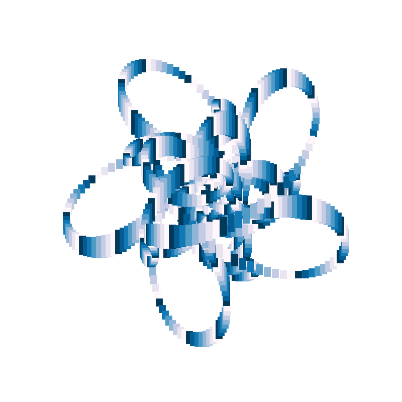
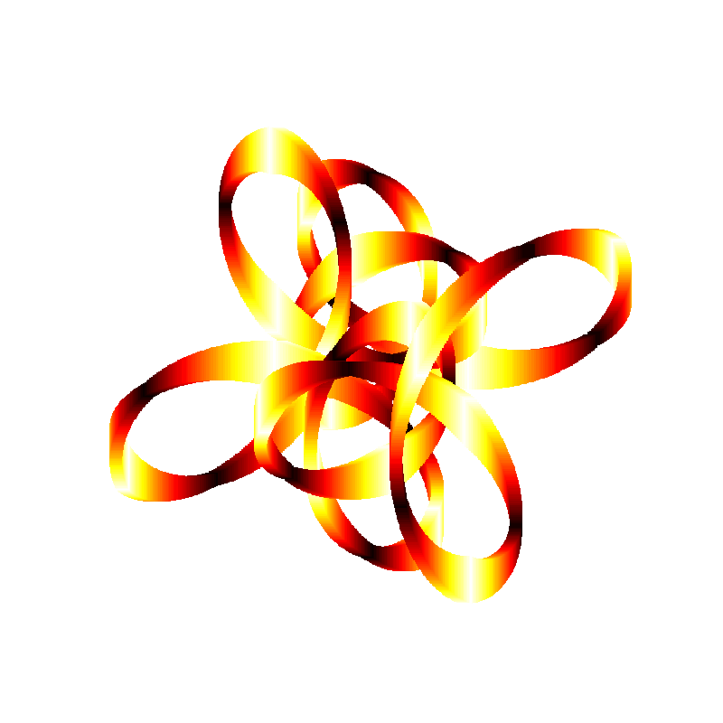
(ds-3.9) PS R:\learn\py_play\spirograph> python spiro_play.test.py -t 3 -p 1000
get_radii(5) -> [1, 0.6844633476519434, 0.662549686044371j, 0.5053406583296401, 0.49598335345447947j]
get_freqs(nbr_w=5, kf=5, mcg=1) -> [6, 11, -9, 21, -4]
colour map: plt.cm.PuBu_r
Test 3: an attempt at changing line thickness for a basic curve plot
That look’s not bad. But, I felt that the abrupt changes in colours needed looking after. So, I am goint to rework the set_colour_map() function in the spirograph plotting library to produce a more thoughtful sequence of colours.
Cycling Colour Gradients
Well, the default set of colours definitely is not a gradient, but the other colour maps are, or at least, very nearly are. What I’d like to have in the colour cycler is the first half going from dark to light and the second half reversing that. But, I’d also want to avoid, if possible, duplicate adjacent colours (in the middle or at the end/start of cycles).
One more thing, you may have noticed that the colour cycle does not match the length of the line width cycle. Will need to fix that as well.
Here’s my initial attempt.
def set_colour_map(ax, n_vals=None):
  clr_opt = ['default', 'plt.cm.GnBu_r', 'plt.cm.PuBu_r', 'plt.cm.viridis', 'plt.cm.hot', 'plt.cm.twilight_shifted']
  u_cmap = np.random.randint(0,5)
  c_cycle = []
  c_rng = 8
  if n_vals:
    c_rng = n_vals // 2
  if u_cmap == 1:
    c_cycle = [plt.cm.GnBu_r(i) for i in np.linspace(0, 1, c_rng)] + [plt.cm.GnBu(i) for i in np.linspace(0, 1, c_rng+2)][1:-1]
    ax.set_prop_cycle('color',c_cycle)   # like this one
  elif u_cmap == 2:
    c_cycle = [plt.cm.PuBu_r(i) for i in np.linspace(0, 1, c_rng)] + [plt.cm.PuBu(i) for i in np.linspace(0, 1, c_rng+2)][1:-1]
    ax.set_prop_cycle('color',c_cycle)
  elif u_cmap == 3:
    c_cycle = [plt.cm.viridis(i) for i in np.linspace(0, 1, c_rng)] + [plt.cm.viridis_r(i) for i in np.linspace(0, 1, c_rng+2)][1:-1]
    ax.set_prop_cycle('color',c_cycle)
  elif u_cmap == 4:
    c_cycle = [plt.cm.hot(i) for i in np.linspace(0, 1, c_rng)] + [plt.cm.hot_r(i) for i in np.linspace(0, 1, c_rng+2)][1:-1]
    ax.set_prop_cycle('color',c_cycle)
  return clr_opt[u_cmap], c_cycle
And, here’s the change to the module code.
  ...
  ln_w = 10

  # set up colour cycler to match the length of our line cycle
  rcm, cycle = splt.set_colour_map(ax, lc_frq)
  print(f"colour map: {rcm} ({len(cycle)})")

  for i in range(t_pts):
    ...
With that change, I ran the module as is, and got this:
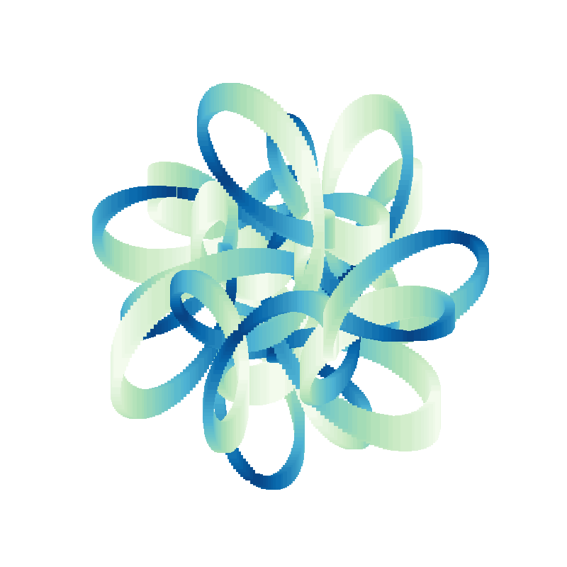
(ds-3.9) PS R:\learn\py_play\spirograph> python spiro_play.test.py -t 3 -p 1200
get_radii(4) -> [1, 0.5139618623084097j, 0.2831469733153874j, 0.18206235452602978]
get_freqs(nbr_w=4, kf=4, mcg=3) -> [-1, -9, 19, 19]
Test 3: an attempt at changing line thickness for a basic curve plot
colour map: plt.cm.GnBu_r (50)
To me that just looks nicer.
Changing Cycle Length
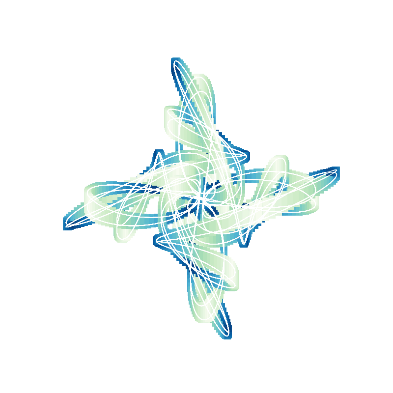
When I ran the module specifying 2000 plotting points this is the kind of thing I could get. Didn’t happen for every curve, but often enough.
Seems to me that a longer colour cycle would look signifcantly better. Expect that some ratio of the number of points would be best. But really not sure what that ratio should be. Nor how to make sure it works well with the number of individual lines plotted. And, there might be some relationship to the frequencies or radii of the wheels. But, let’s play with that idea anyhow. For 1000 plotting points I was using a cycle of 50 colours. So, let’s try using that as our ratio.
But, I would also like the cycles to start at t=0 and end at t=2*np.pi. That strikes me as a possible problem. And then there is the issue of the line size multiplier. The longer the cycle the bigger those lines in the middle for a given multiplier. But one thing at a time.
Set Cycle Length as Ratio of Total Plotting Points
Not much involved here.
  # lc_frq = 50
  lc_frq = t_pts // 20  # need an integer
Quick test.
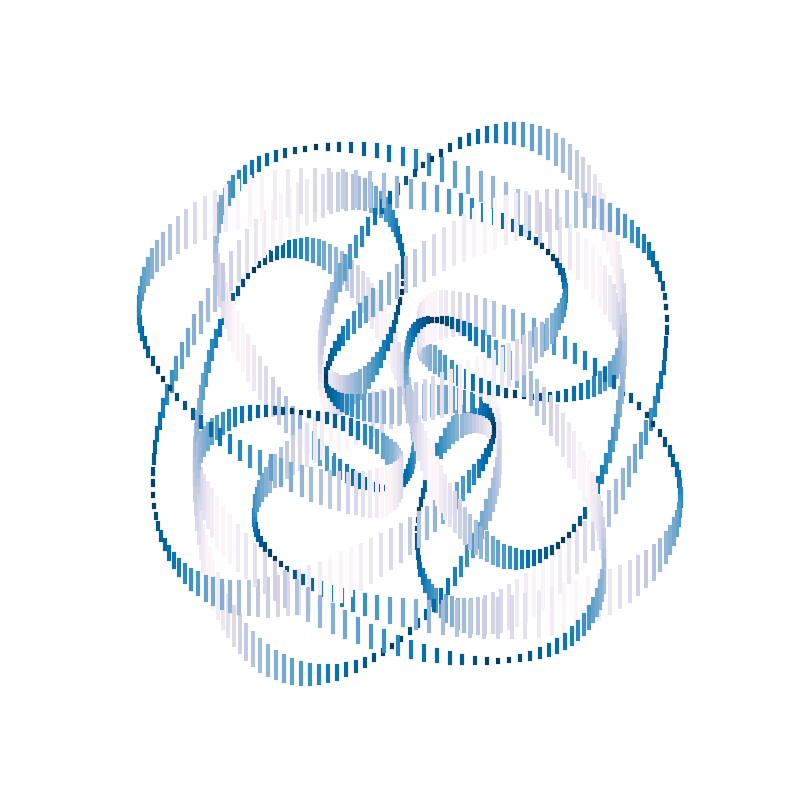
(ds-3.9) PS R:\learn\py_play\spirograph> python spiro_play.test.py -t 3 -p 2400
get_radii(6) -> [1, 0.5813221135906815, 0.4140467742875211, 0.3174958642362529, 0.2834530654385339, 0.2414305381999373j]
get_freqs(nbr_w=6, kf=3, mcg=2) -> [2, -10, -4, -10, -7, 14]
Test 3: an attempt at changing line thickness for a basic curve plot
colour map: plt.cm.hot (120), cycle mod pts: 120
That looks nicer. Though I think the line height/width at the center of the cycle is just a little too big.
Controlling Line Height
I decided the easiest thing would be to set a maximum line height. May play with the value, but for now here’s the changes.
  # lc_mult = .0075
  max_ln_len = 0.1875
  lc_mult = 2 * max_ln_len / lc_frq
And, a test run.
ds-3.9) PS R:\learn\py_play\spirograph> python spiro_play.test.py -t 3 -p 2400
get_radii(6) -> [1, 0.7378329311553978j, 0.4591666130742016, 0.3042327922659783j, 0.2577739789601274, 0.1983748784283839j]
get_freqs(nbr_w=6, kf=2, mcg=1) -> [1, -7, 3, -7, 3, -5]
Test 3: an attempt at changing line thickness for a basic curve plot
colour map: plt.cm.hot (120), cycle mod pts: 120
That looks pretty good to me. What do you think?
But, I think I will change that to randomly select from a small range of maximum heights and see how that works. Easy enough.
# lc_mult = .0075
# max_ln_len = 0.1875
max_ln_len = np.random.random()*(.2 - .175) + .175
lc_mult = 2 * max_ln_len / lc_frq
And some quick tests say that seems to work just fine. Though I am sure an artistic individual would likely be more creative in their approach. Here’s one of the test plots.
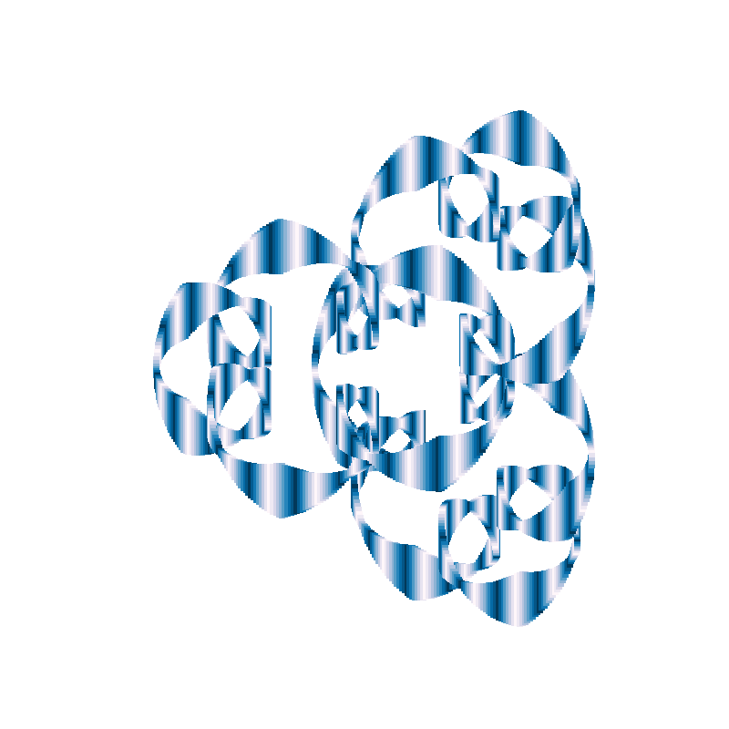
(ds-3.9) PS R:\learn\py_play\spirograph> python spiro_play.test.py -t 3 -p 2400
get_radii(7) -> [1, 0.5025923137574423, 0.41231003524324655j, 0.25981923143474805, 0.1712084603533276, 0.16298532183988593, 0.12566322599868235j]
get_freqs(nbr_w=7, kf=7, mcg=5) -> [5, -9, -23, -16, 19, -23, -23]
Test 3: an attempt at changing line thickness for a basic curve plot
colour map: plt.cm.GnBu_r (120), max line height: 0.19087070404763695
There’s only one other thing I’d like to try and fix at the moment. The jagged edges on some of the plots, particularly when using smaller numbers of plotting points.
Get Rid of the Jagged Edges
Well, maybe. Going to take some playing around I suspect.
My first thought is to save the coordinates for each line end, then use them to plot a curve the same colour as the background. So, that’s what I am going to try. I’ll track the end points of the lines, one set for each end point, then plot a line along those end points.
    c_adj = (i % lc_frq) + 1
    if c_adj >= lc_dir:
      c_adj = lc_diff - c_adj
    y_up, y_dn = c_y+(c_adj*lc_mult), c_y-(c_adj*lc_mult)
    ax.plot([c_x, c_x], [y_up, y_dn], lw=ln_w)
    jag_x.append(c_x)
    if c_adj >= lc_dir:
      jag_2y.append(y_up)
      jag_1y.append(y_dn)
    else:
      jag_1y.append(y_up)
      jag_2y.append(y_dn)

    ax.plot(jag_x, jag_1y, color='w', lw=1)
    ax.plot(jag_x, jag_2y, color='w', lw=1)
Quick test.
(ds-3.9) PS R:\learn\py_play\spirograph> python spiro_play.test.py -t 3 -p 1000
get_radii(7) -> [1, 0.7428055669263758, 0.6011859822823031j, 0.42098262041930556, 0.2993970424813519, 0.26130824254871815, 0.18746515676351896]
get_freqs(nbr_w=7, kf=4, mcg=3) -> [3, -9, 15, -13, 15, 7, 3]
Test 3: an attempt at changing line thickness for a basic curve plot
colour map: plt.cm.GnBu_r (50), max line height: 0.1924904624183694
As pretty as it is, that did not work. But, perhaps something to think about from the “artistic” point of view.
I tried to find a set of “adjustment” values for the x and y coordinates that might get me what I wanted. But no go. So, I am just going to live with the jagged edges. At least for now. Keeping in mind that they are less visible with larger numbers of plot points.
But, I like the effect of the white lines, so am going to add a switch to control their presence or absence. I will default to absent.
One last thing — width of the individual lines.
Random Line Widths
I decided to have a look at the effect of the plotted line width on the final image. So, I decided to select it at random and look at few plots at 1000 plot points to see if I have any preference. Simple enough.
  #ln_w = 10
  ln_w = np.random.choice(list(range(1, 13)))
Here’s one of the resulting images I liked (well, liked most of them).
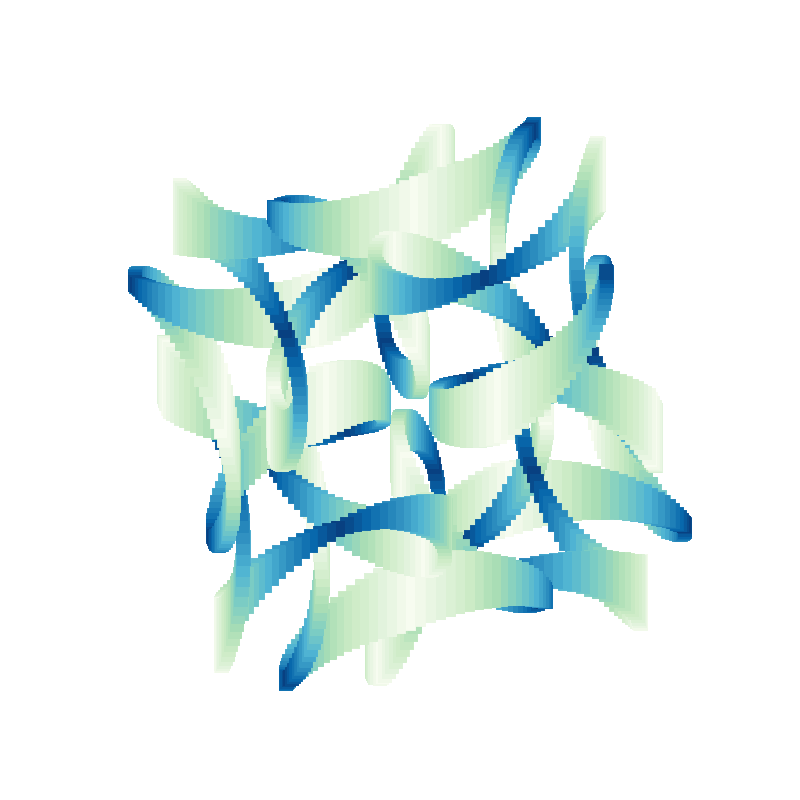
(ds-3.9) PS R:\learn\py_play\spirograph> python spiro_play.test.py -t 3 -p 1000
get_radii(6) -> [1, 0.5472252291136623, 0.3718122746913235, 0.34693564899937956j, 0.24316320070230124j, 0.13261206097742026j]
get_freqs(nbr_w=6, kf=4, mcg=1) -> [-3, -11, -11, -7, 13, -15]
Test 3: an attempt at changing line thickness for a basic curve plot
colour map: plt.cm.PuBu_r (50), max line height: 0.17857555222804347, line width: 3
And, let’s add those white curves. So easy to do.
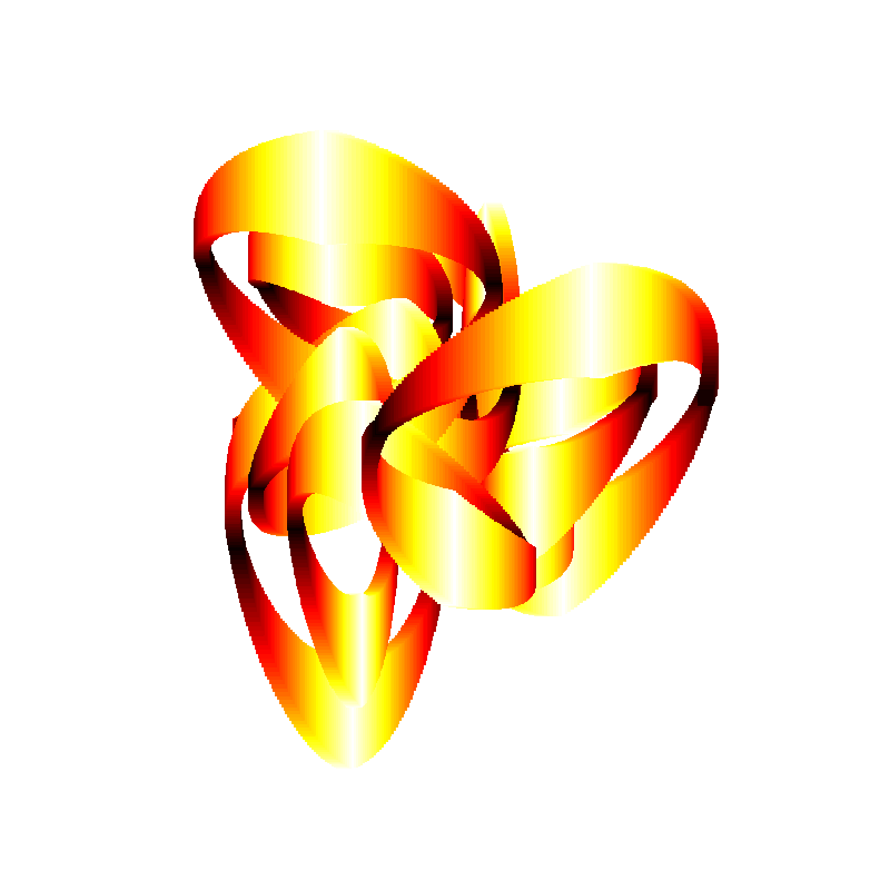
(ds-3.9) PS R:\learn\py_play\spirograph> python spiro_play.test.py -t 3 -p 1000 -wc
get_radii(3) -> [1, 0.6384333152668354, 0.6171811837232941]
get_freqs(nbr_w=3, kf=2, mcg=1) -> [-1, 9, -5]
Test 3: an attempt at changing line thickness for a basic curve plot
colour map: plt.cm.PuBu_r (50), max line height: 0.19054675511181382, line width: 3
Done
I think that’s it for this one. Some very entertaining images. A bit of experimentation and even more fun.
Don’t know if this is going to be it for this series of posts. I know I personally am not done with this experiment. I want to look at the result of drawing the lines parallel to the y-axis, or at an angle to the axes. Maybe even see if I can get the lines drawn more or less perpendicular to the curve.
I also plan on writing a module that will allow me to select any of the types of images we have been generating. I.E. simple curve, animated simple curve, animation with wheels, curve with cycling curve thickness, multi-line (gnarly) plots, figure with multiple subplots showing changing curve parameter for a fixed parameter, etc. With the curve parameters being randomly generated for each plot.
And, I am currently thinking, if I do those things, I may as well continue writing about them.