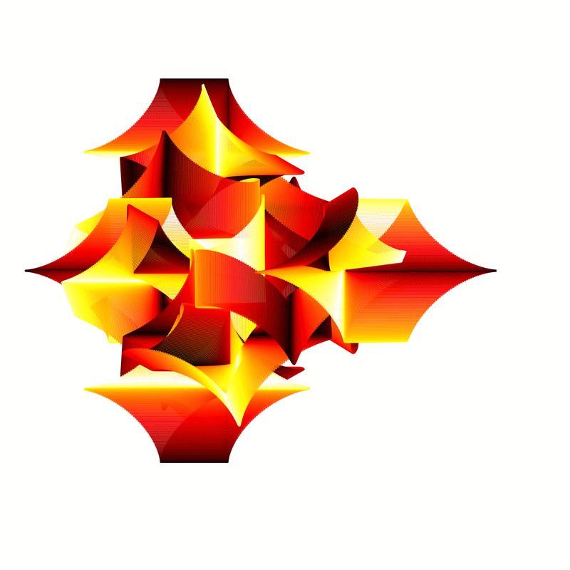
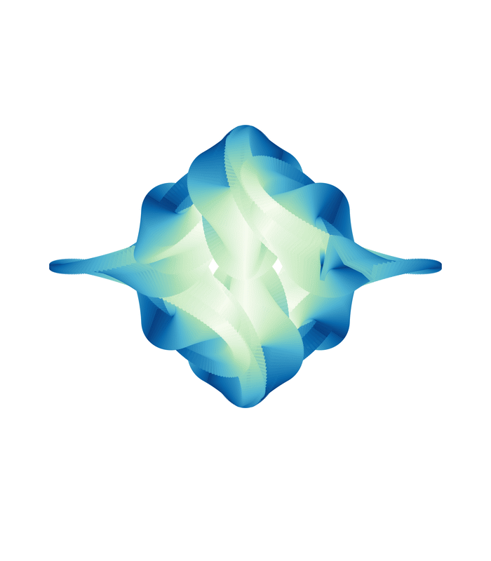
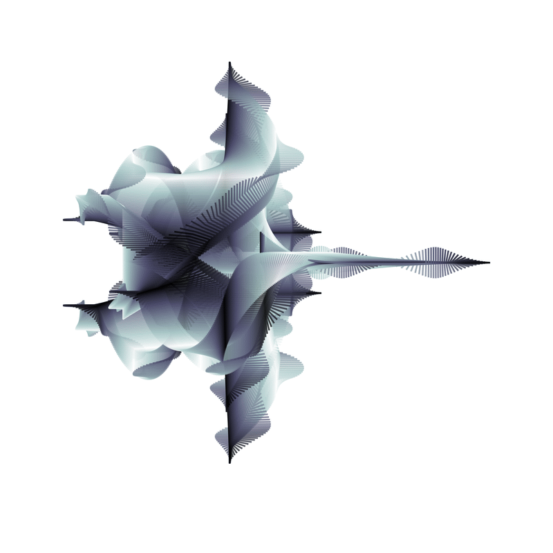
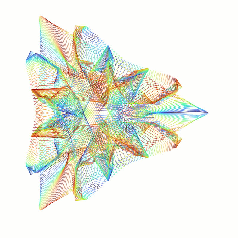
Hello folks. Sent some of you the link to this page because I wanted to get your feelings with respect to this post’s title. Given it is my code generating them, I feel I am rather biased.
So, I would appreciate it if you would have a look at the following images. (There are a lot of them, so don’t look at this page using a mobile data link.) Then let me know if you would consider hanging any of them on a wall in your home (or even the garage). Which ones did you like the most, if any of them at all?
Note, as they are png images you can likely zoom in a fair bit without losing a lot of image quality. But, they have been reduced in size from 8400x8400 pixels to 800x800 pixels. So some detail has been lost compared to the much larger images. Perhaps a significant amount in some cases.
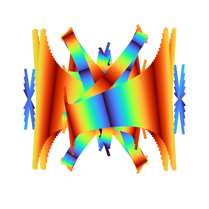
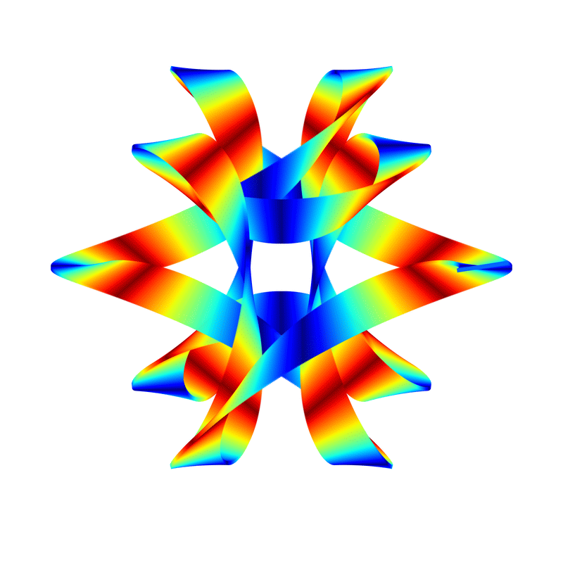
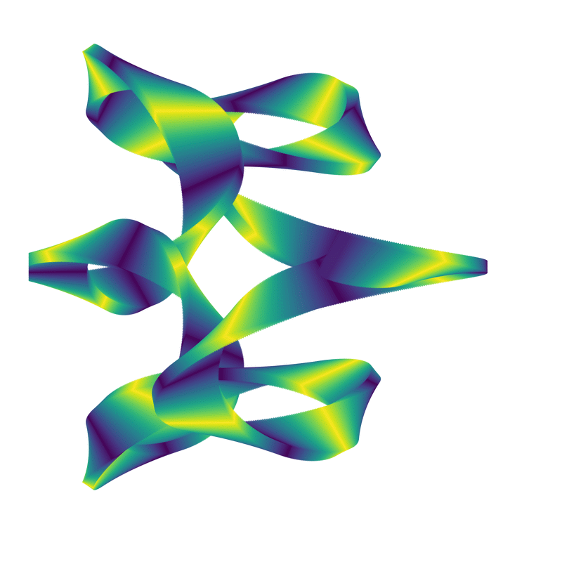
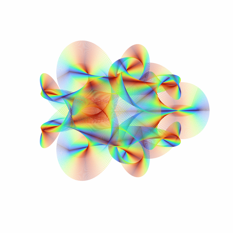
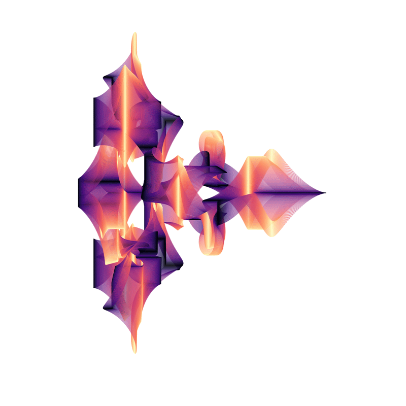
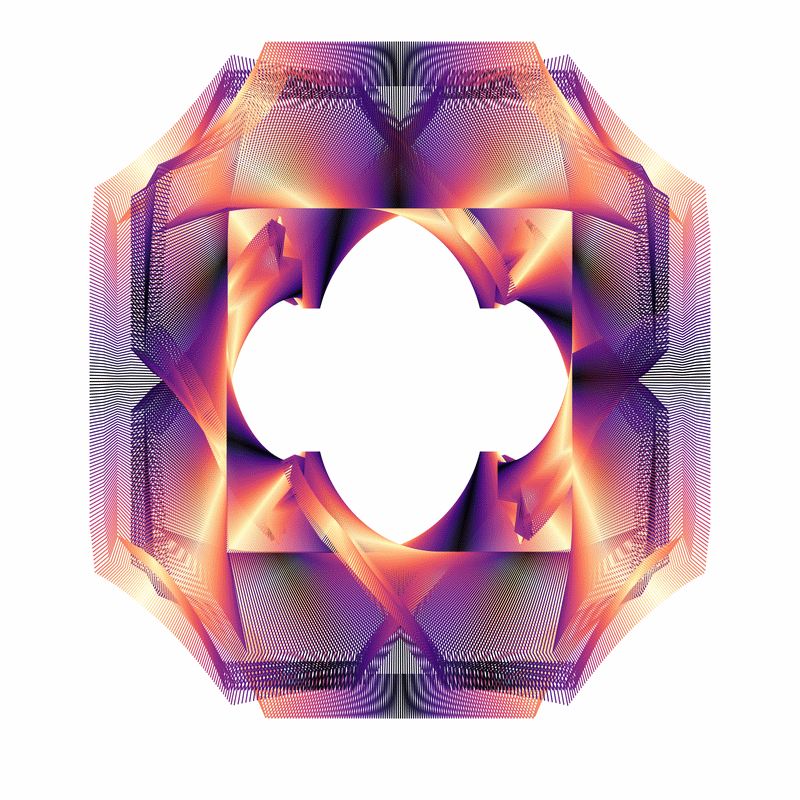
The three images above used variations of the line width cycling algorithm. The following all use the gnarly algorithm.
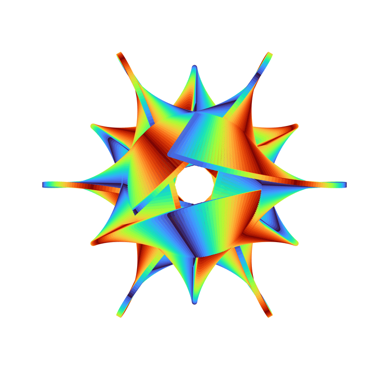
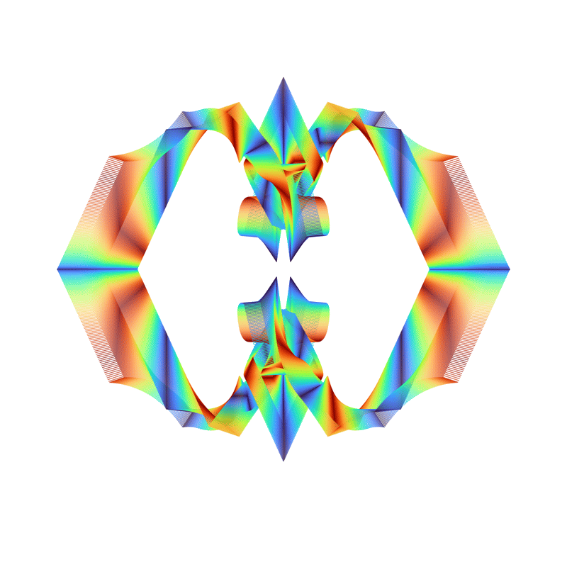
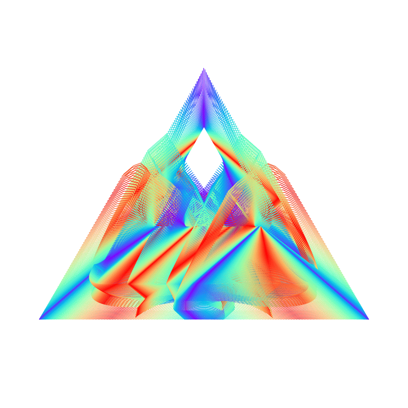
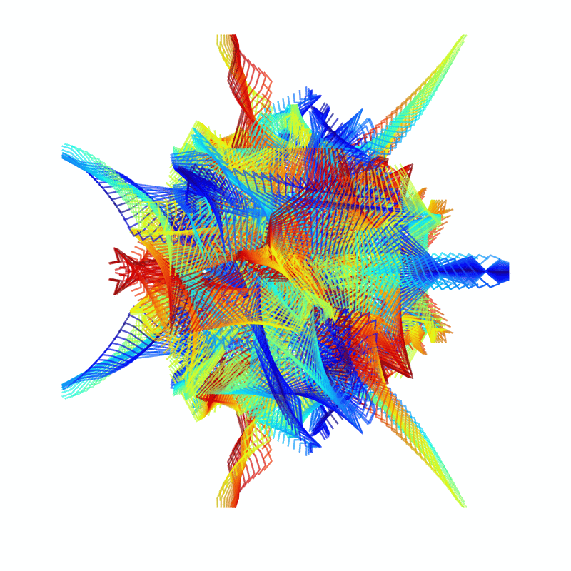
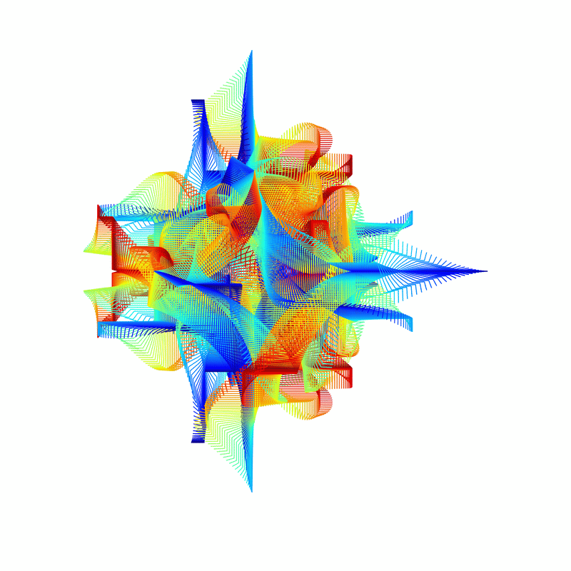
Sorry, apparently I like the jet colour scheme. And, my apologies, I did use a rather limited number of colour schemes.
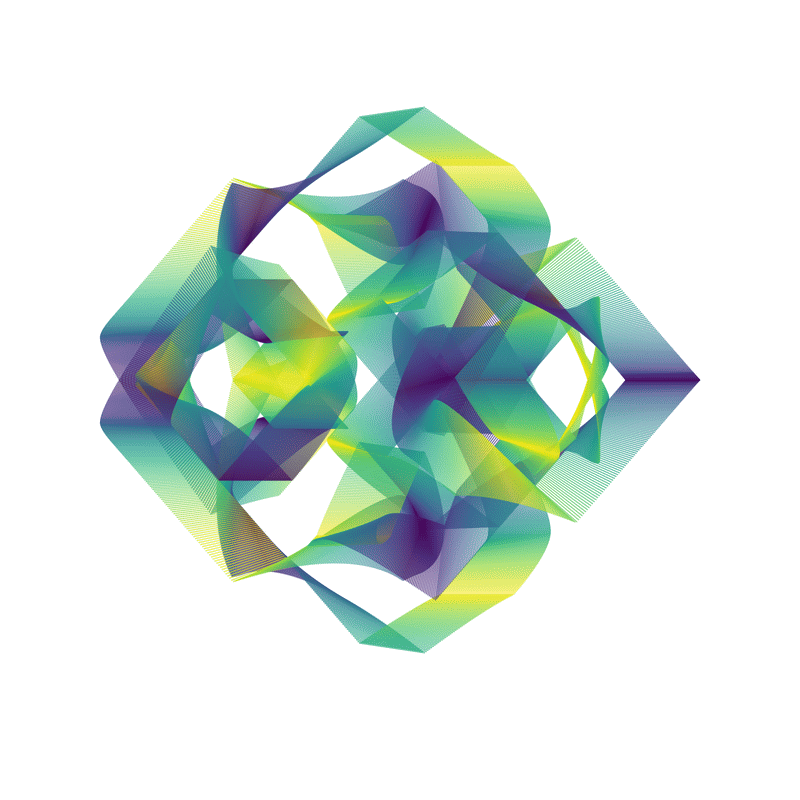
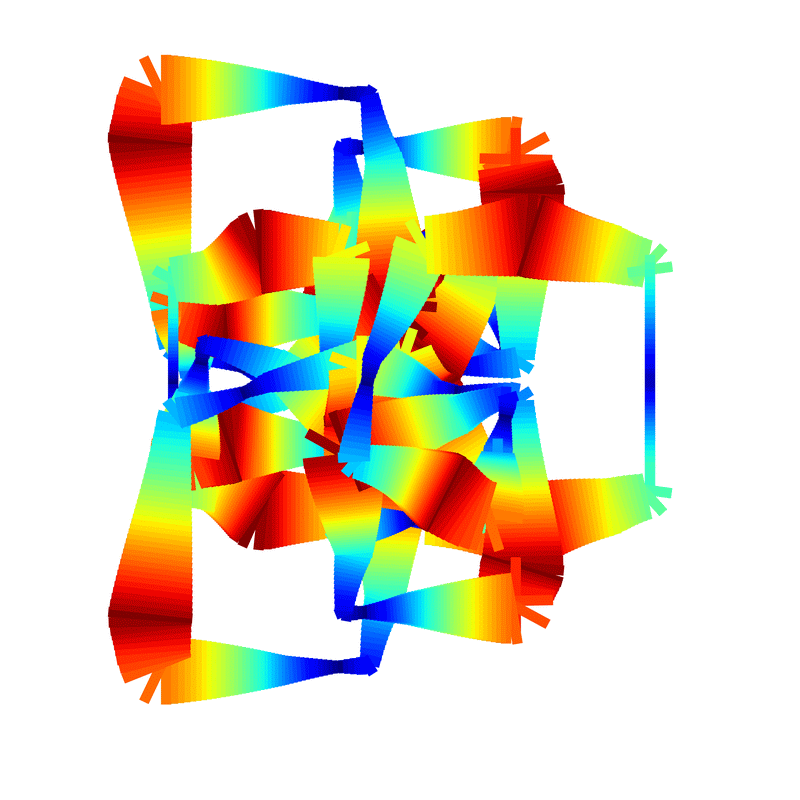
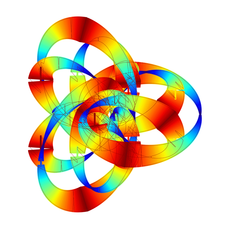
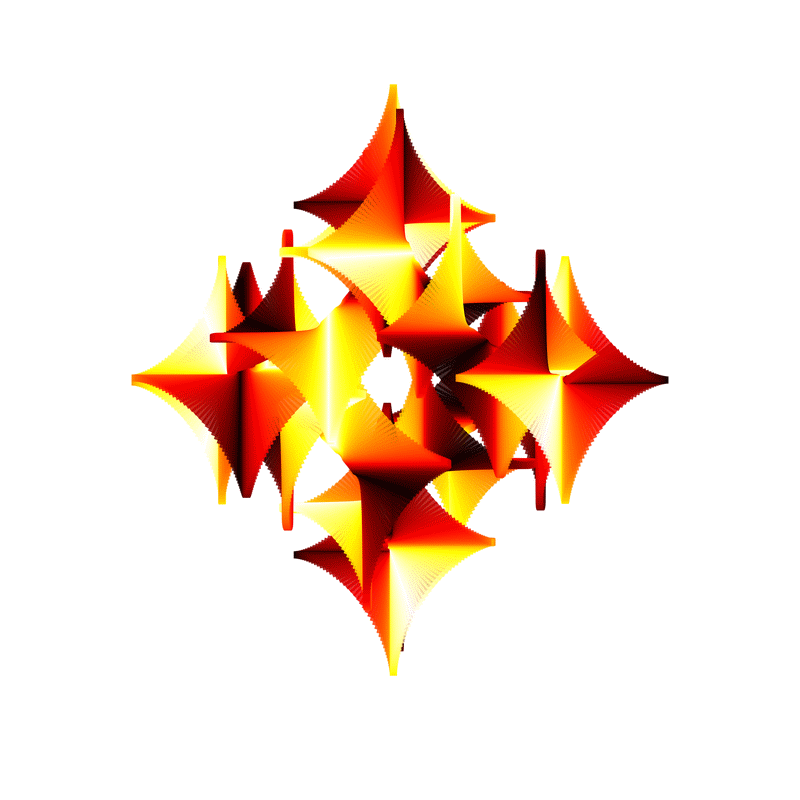
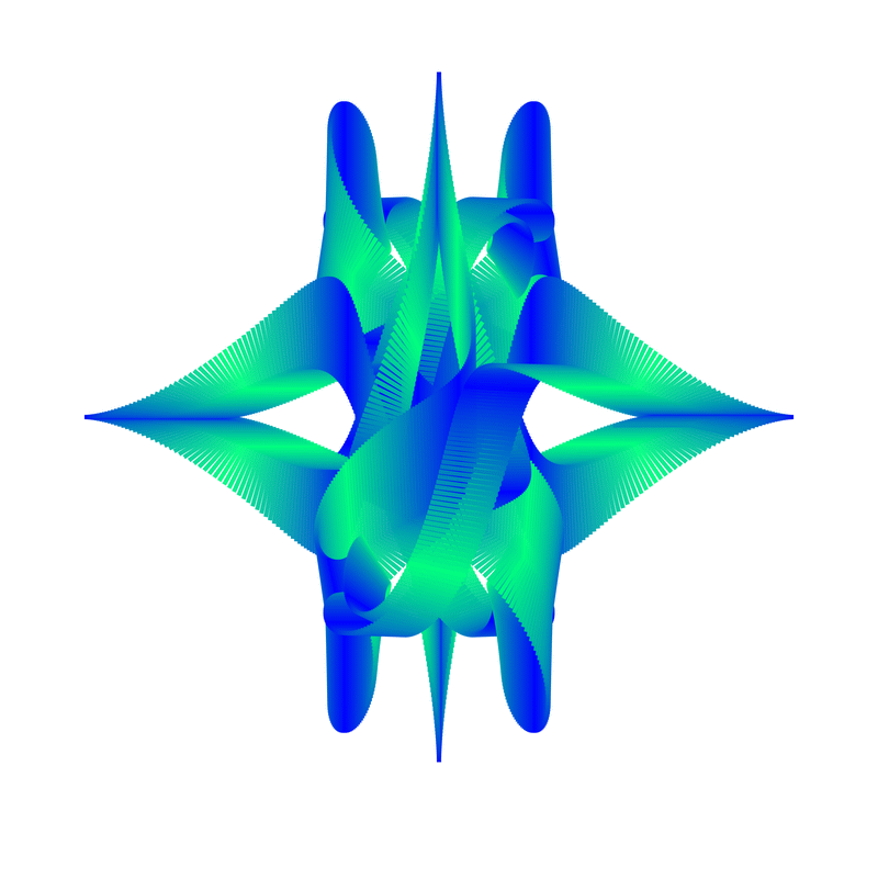
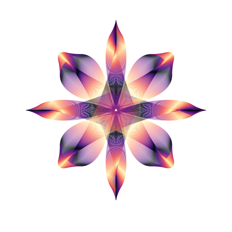
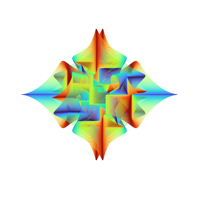
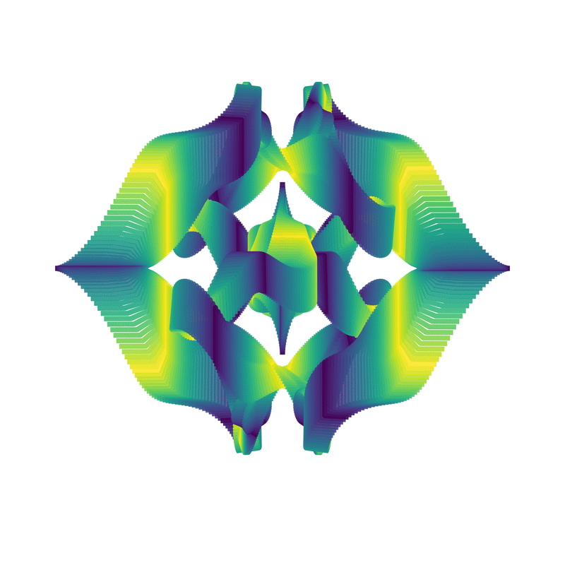
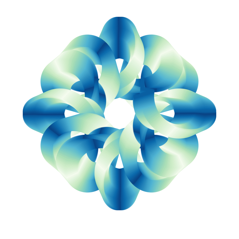
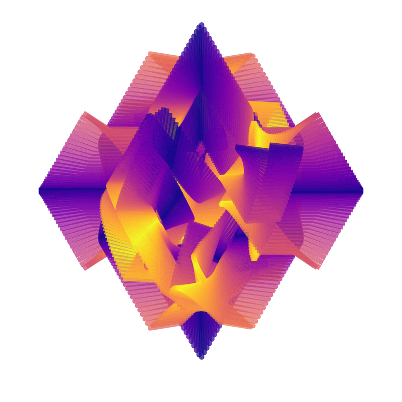
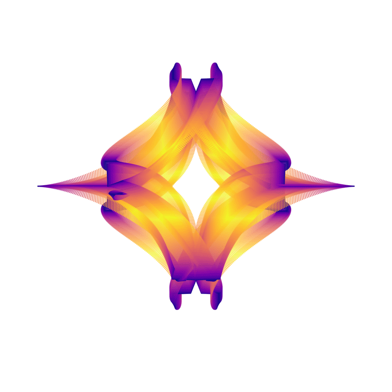
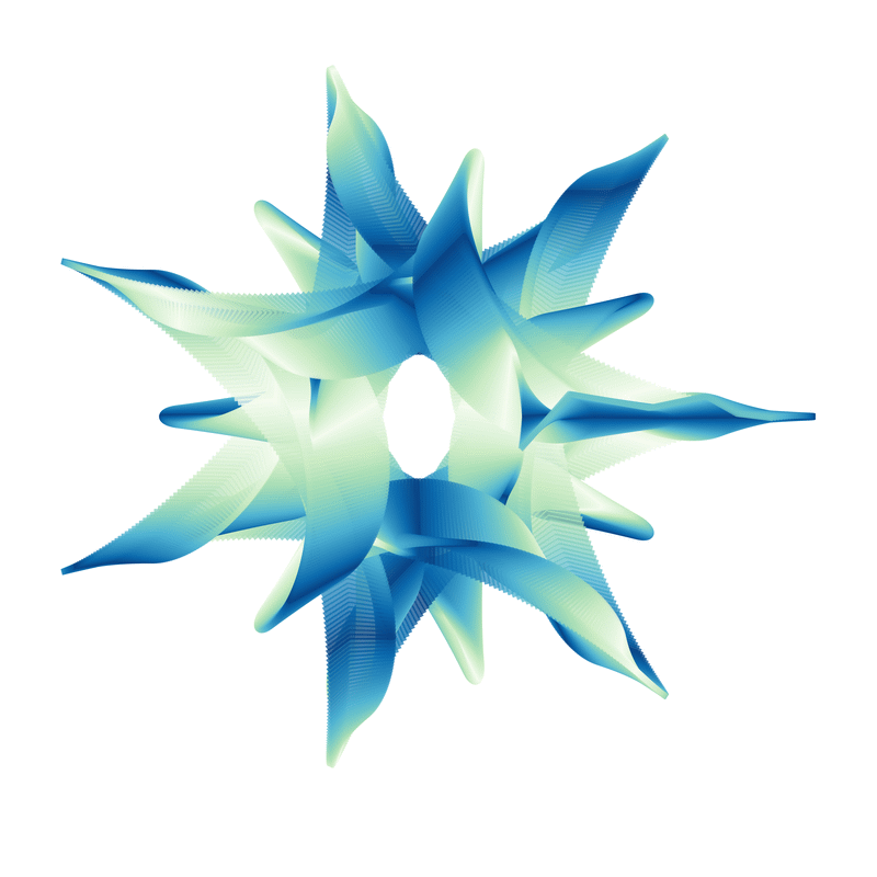
The above four images all had the same number of wheels and symmetry (3_3_1). The key difference is the wheel shape (show in brackets) and the sizes and rotational frequencies (which I decided not to show).
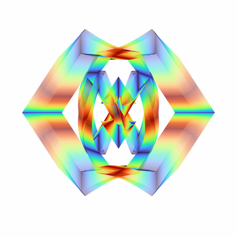
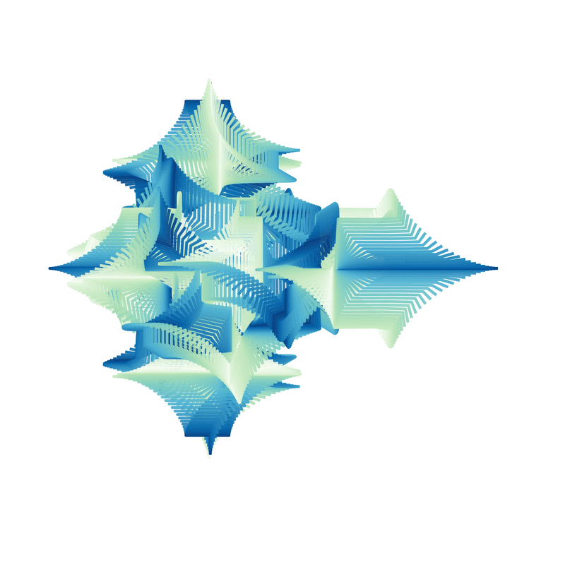
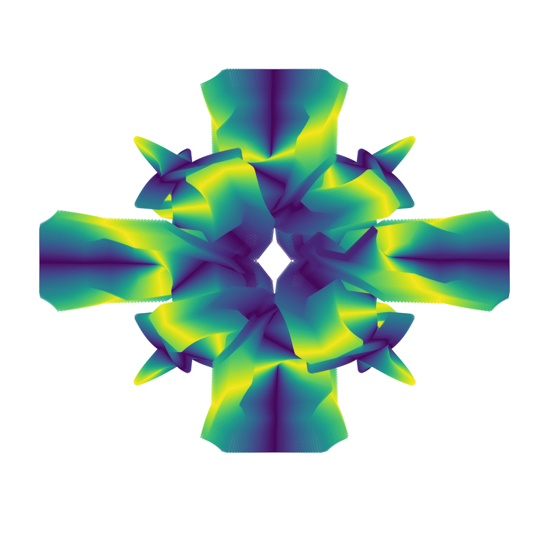
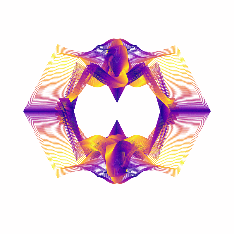
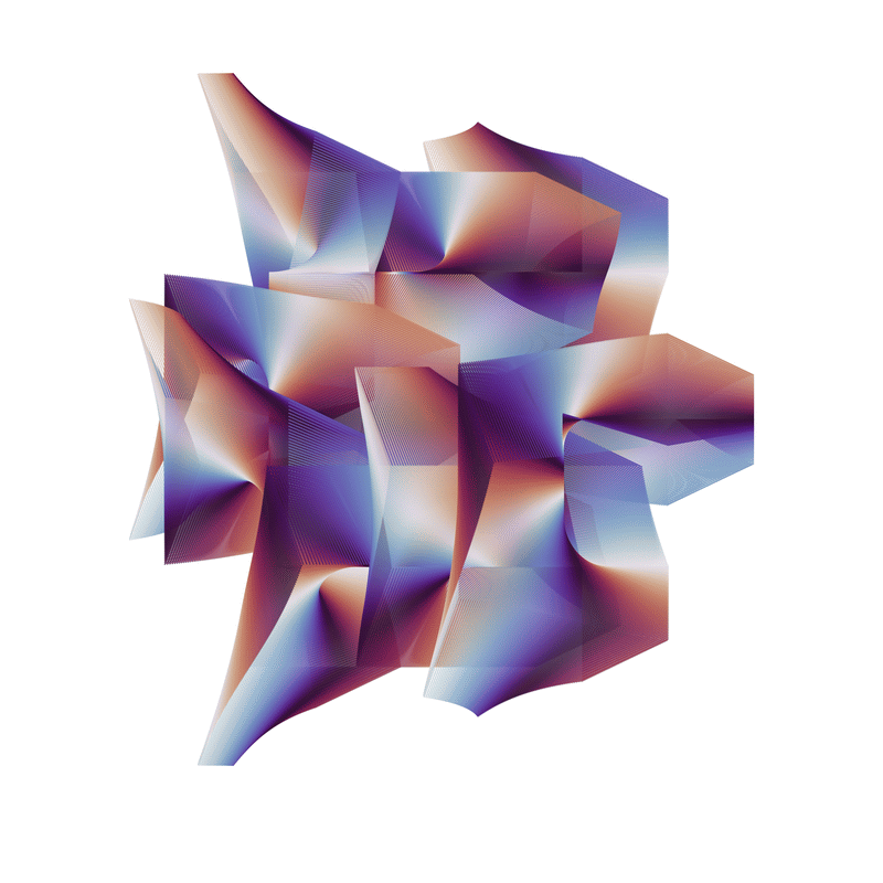
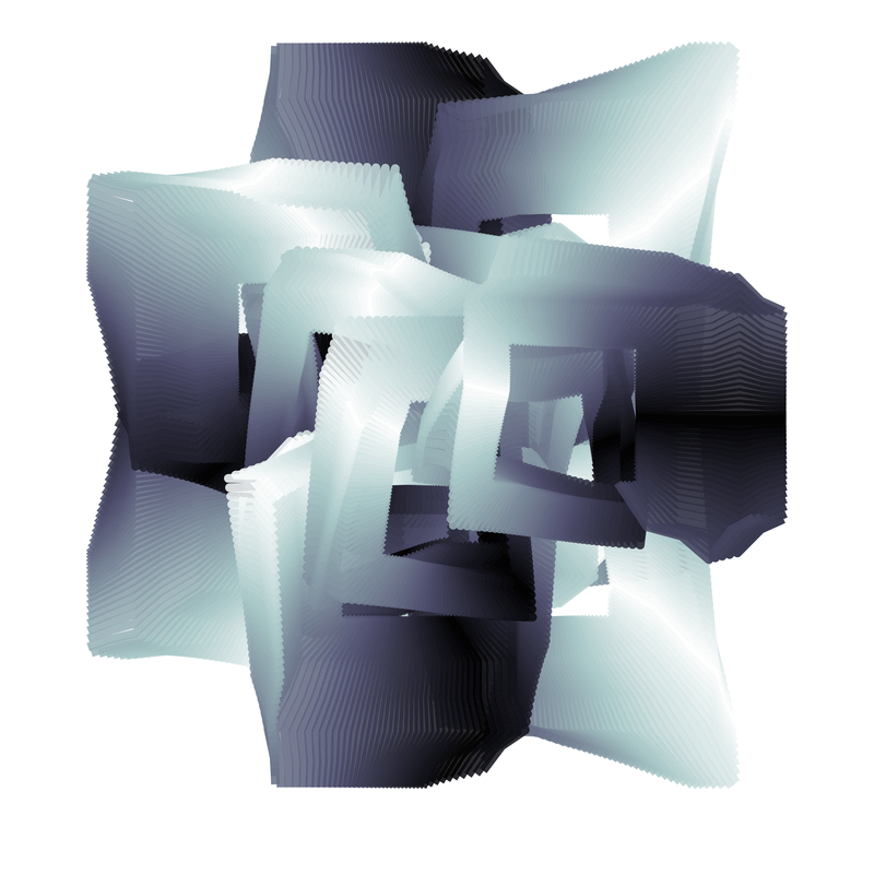
Similar, but not.

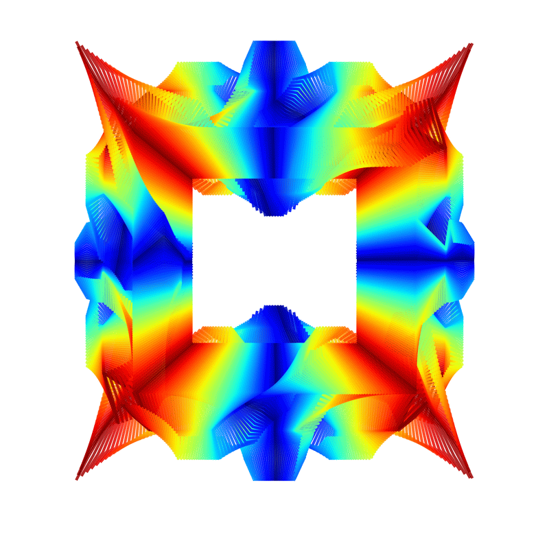
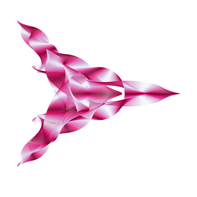
Kinda like how that central box seems to affect the curve at the top and bottom of the box and just wipes it out on the sides.
Well, art or not, I can certainly waste a goodly chunk of time just sitting at the computer repeatedly generating images of one sort or another.