As mentioned last time, I’d like to give you a number of paint-by-number images showing how the variations affect the final result. Given the same underlying curve for each of course.
Haven’t quite decided, but I may make the images smaller than usual so that it is easier to get 2 or 3 on screen at the same time. Though I guess you could just use two separate browser windows. (And, several days later, I decided on the latter.)
I wanted to show you virtually every variation using the same underlying curve. And, have made a number attempts to do so. But every single time, I have failed. Once or twice a bug ended my attempt. Once or twice, pressing the wrong key ended my attempt. So, you will not be seeing all the variations based on a single curve. You may not even get to see all the variations. Time will tell regarding the latter.
But, I do find these images entertaining—if a touch too geometrical and symmetrical for my tastes. But perhaps I can fix that down the line. (Guess that might be a hint that there will be another post or two.)
Some Explanations
There are basically two functions used to generate the images: btw_rnd() and btw_n_apart(). There are two additional ones that simply swap the between axis used for plotting the colours. They have an _x appended to the end of the function name.
btw_rnd() and btw_rnd_x() have the following parameters:
bc='e', the base row, all plots are some other row against this row. ’e’: end, ’m’: middle, ’s’: start, ‘r’: random plotting orderr=False, reverse the order in which the colours between data rows are applied to the imagefix=None, used a single row for the initial data for every call to the matplotlib colour between functionmlt=False, not used here, for another post perhapssect=1, not used here, for another post perhaps
btw_n_apart() and btw_n_apart_x() have the following parameters:
dx=1, number of rows between the rows used to generate a single colour plot for the imageol=True, overlap rows when generating the image (see previous post)r=False, reverse the order in which the colours between data rows are applied to the imagefix=None, used a single row for the initial data for every call to the matplotlib colour between functionmlt=False, not used here, for another post perhapssect=1, not used here, for another post perhaps
Example Set of Images
The underlying curve for these images has the following parameters:
wheels: 8 (Circle), k_f: 4, cgv: 1, points: 1024
widths: [1, 0.5941544842574074j, 0.3400796317203622, 0.30783316766495217j,
         0.2531585503358961, 0.15552586377293937, 0.125, 0.125j],
heights: [1, 0.6083287815584236, 0.3631197062639452, 0.36194846265240344j,
          0.33328781986521594j, 0.21418744611737242, 0.1362848669816498j, 0.125j],
freqs: [5, -7, -11, -7, -3, -11, -11, 1]
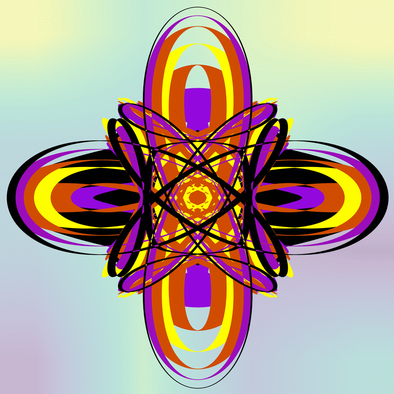
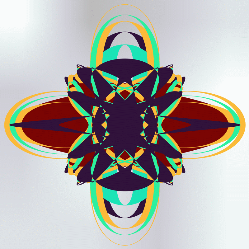
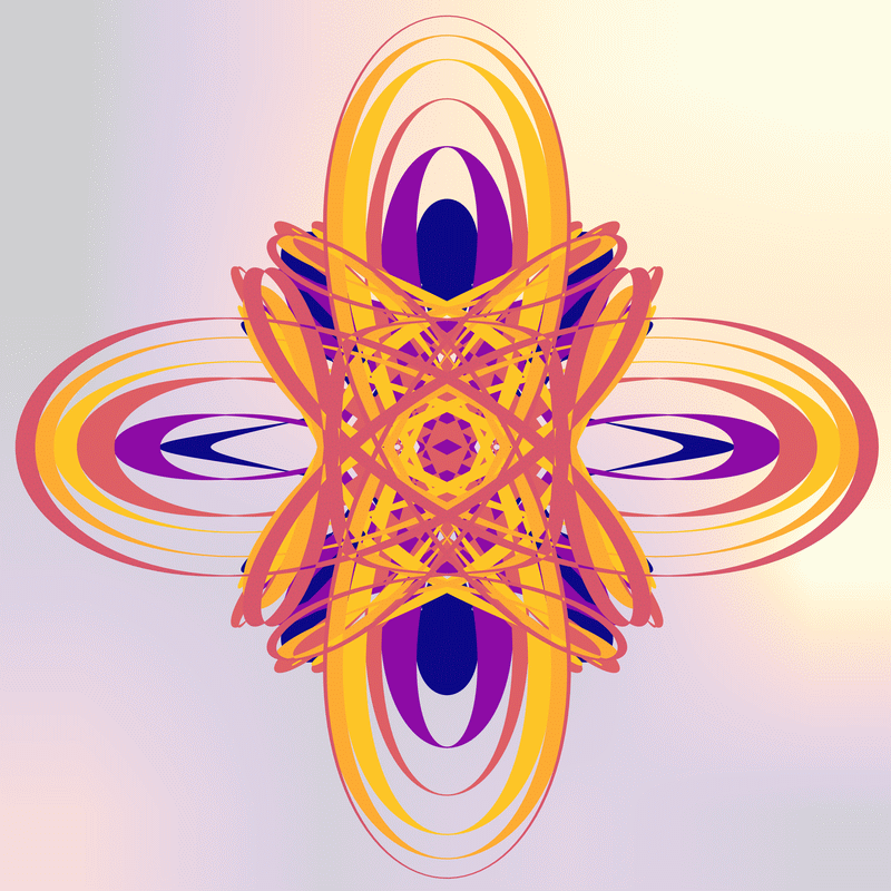
Start with the defaults.

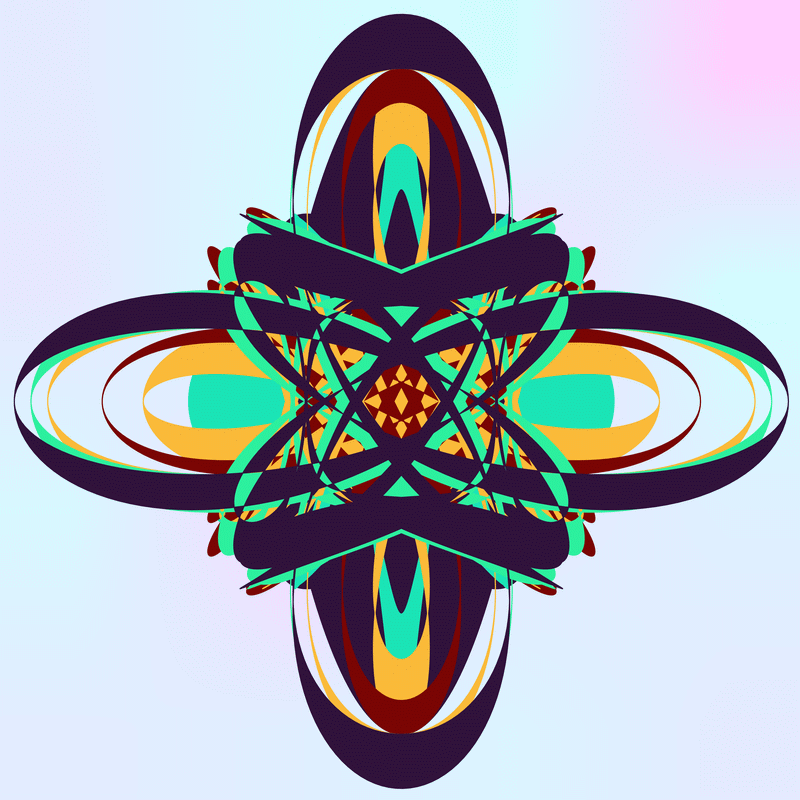
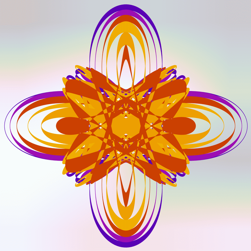
Swap axis for colouring between.
Switching from plot between y and x seems to effect a rotation.
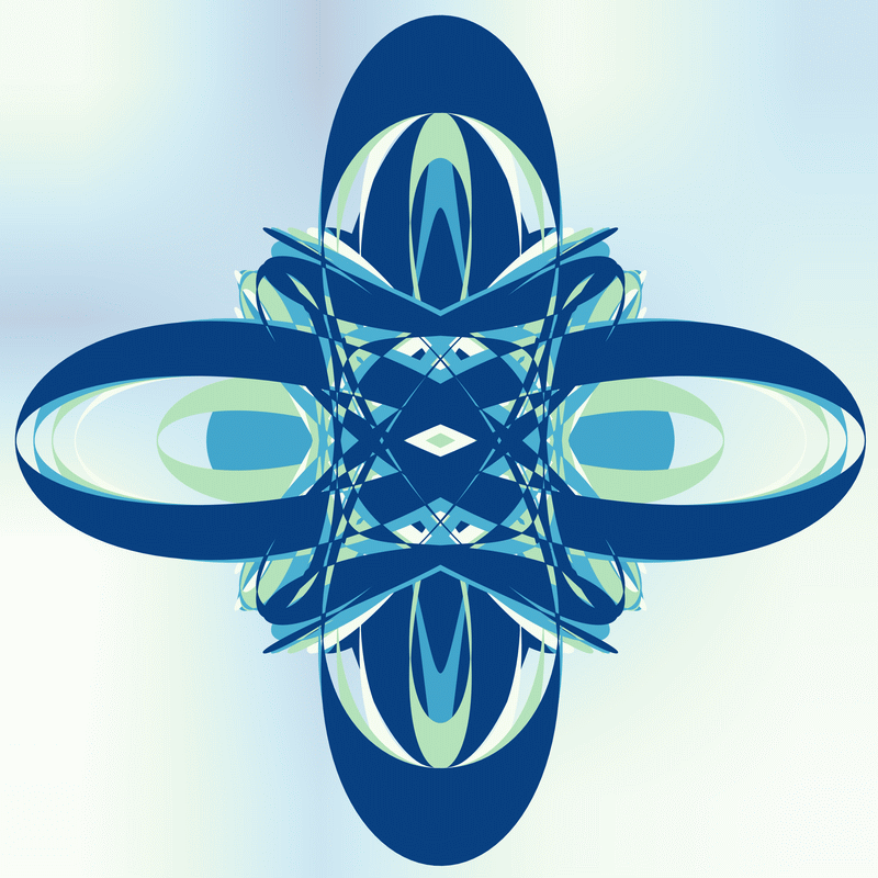
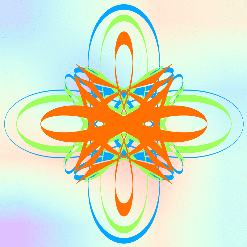
Let’s try setting the middle row as the base row. And back to colouring on the y axis.
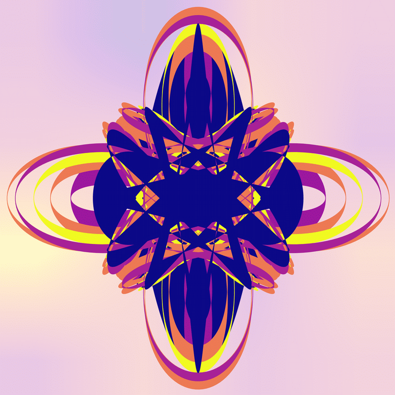
And, a random row selection.
Given the base row only differs by 1 to the one above, a similar image. But, still visible differences.
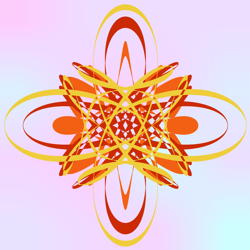
Now, let’s use a randomly selected row, but also use a random order plotting individual colours onto the image.
And another. This time colouring along the x axis.
As expected, a rotation of the image. And some variation due to base row selection and plotting order changes.
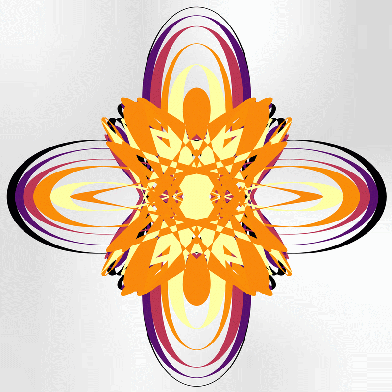
Okay, some using the 2nd plot function.
No overlap and reversing the plotting order for the above.
As one would expect, less coloured lines. And, perhaps less interesting.
And, again without reversing the order of the coloured lines.
And, because I am plotting an odd number of lines in total, a different set of lines gets used this time (in the above).
The previous one ran like this:
btw_n_apart(dx=1, ol=False, r=True, fix=None, mlt=False, sect=1)
  ax.fill_between(r_xs[6], r_ys[6], r_ys[7])
  ax.fill_between(r_xs[4], r_ys[4], r_ys[5])
  ax.fill_between(r_xs[2], r_ys[2], r_ys[3])
The one above:
btw_n_apart(dx=1, ol=False, r=False, fix=None, mlt=False, sect=1)
  ax.fill_between(r_xs[1], r_ys[1], r_ys[2])
  ax.fill_between(r_xs[3], r_ys[3], r_ys[4])
  ax.fill_between(r_xs[5], r_ys[5], r_ys[6])
Let’s have a look at colouring on the x axis with overlapping data.
Very similar to the third image above.
And again, but reversing the plotting order.
And, now, plotting between the data row two away. Without reversing the plotting order.
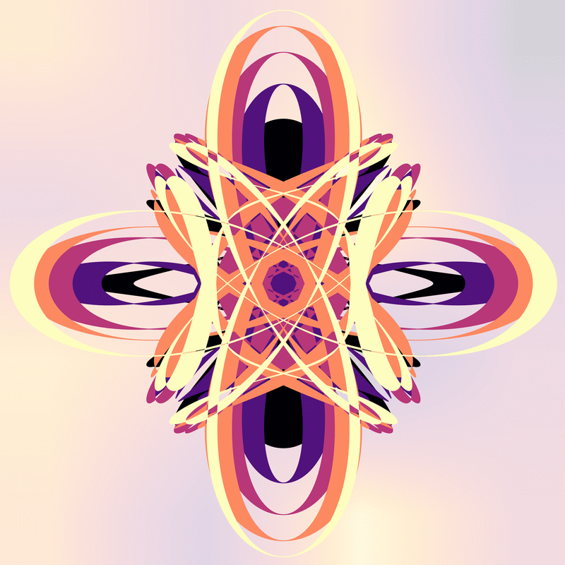
Some, but not a lot of, difference between the one using dx=1.
And, here’s where I pressed the wrong key and got dropped out of the loop for the command line interface.
Done M’thinks
Given the underlying curve data is the same, I expected the images to look very similar. But, there are subtle differences with each of the variations. And, for some curves (other wheel shapes, larger numbers of wheels, etc.), I found the differences could be more obvious.
No code. No new or real information. But a bunch of possibly interesting pictures. So, I think I will call it quits for this one.
That said, I have been thinking about using a multiplier to make the line thicknesses larger or smaller to see what happens to the images. And, I have been contemplating on a way to get more coloured sections on the images. And, it might be interesting to see what happens to these images when I apply my anti-symmetry code to them.
So, at least one more spirograph related post.