It has taken me quite some time to recover mentally from my aortic valve replacement. Just over two weeks in hospital due to some complications. Surgery on December 18, 2025. Not released until January 3, 2026. Not a particularly fun Christmas or New Year. Since my return home, up until the last day or two I had no interest in coding or blogging. But, have today (February 1st) decided to see if I can handle some coding and drafting a post for the future.
In the last year of my bachelor’s degree, I took a course that explained calculus in a non-theoretical way. Graphs, geometry and such. I couldn’t find the text book for the course (thought I’d kept it), but I am going to try to do something similar over the next few posts. Likely short posts and a slow going development of the related concepts and code. I plan on using Python and a plotting package to display the curves and how we can approximate/simulate the differential and/or a definite integral over a curve of some sort of data. We shall see how that goes or doesn’t go.
Underlying Requirements
For this to work in a meaningful way, I believe we need a useable story for the curve to which we will be attempting to apply some basic calculus. For that purpose, I propose we look at the charging and discharging of the storage battery for a residential solar and/or wind turbine electrical system. The curve will show the available “charge” in the battery over the period of a day or so. It will definitely not be based on reality, as I do not have such a system nor access to any meaningful data from which to generate the curve.
But it will allow us to talk about the rate of change for any period of time, the amount of charge stored or used for any period of time, etc. All views of the available data related to the concepts of derivation and integration in calculus.
I am going to apply a number of assumptions to make my life a little easier. I will assume that the solar panels and/or wind turbines can generate enough electricity to power whatever equipment is used during the sunlight hours and to charge the battery for later use. I am also going to assume the battery never runs out of available power—don’t want to deal with having another source of power to supplement the solar/wind generation. In addition I am going to assume that the battery never reaches 100% stored energy. Likely keep the battery between 20% and 80% for the day. I am hoping this will make it easier to come up with a suitable function for the curve of the storage state of the battery during the day in question.
New Project Environment
(base) PS R:\learn\py_play> md ..\mc
(base) PS R:\learn\py_play> cd ..\mc
(base) PS R:\learn\mc> git init
Initialized empty Git repository in R:/learn/mc/.git/
(base) PS R:\learn\mc> conda create -n mc-3.14 python=3.14
Retrieving notices: ...working... done
Collecting package metadata (current_repodata.json): done
Solving environment: done
... ...
Proceed ([y]/n)? y

Downloading and Extracting Packages

Preparing transaction: done
Verifying transaction: done
Executing transaction: done
#
# To activate this environment, use
#
#     $ conda activate mc-3.14
... ...
(base) PS R:\learn\mc> conda activate mc-3.14
(mc-3.14) PS R:\learn\mc>

(mc-3.14) PS R:\learn\mc>conda install matplotlib numpy seaborn -c conda-forge
Collecting package metadata (current_repodata.json): done
Solving environment: done

## Package Plan ##
... ...
Downloading and Extracting Packages

Preparing transaction: done
Verifying transaction: done
Executing transaction: done
(mc-3.14) PS R:\learn\mc>
Expect other packages may be required, but…
Let’s Start by Plotting Our Charging Curve
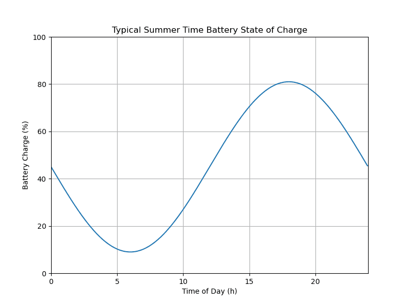
For now I will look at plotting the total available charge, as a percentage, at any given time in the day. Took some fooling around.
I do not plan to show the code for the function to generate the curve. The actual equation for the curve really isn’t needed to understand what is going on in this series of posts. I will just say that in the module ../calculus/p_p1.py there is a function, soc_fn, defined that returns the batteries state of charge (%) for any time in the day (00:00 - 24:00). If you are really interested see Calculus I: Appendix.
When continuing work on the post, I realized I might want to zoom in on some portion of the state of charge curve. So I added a function to help out. I have modified the earlier draft of the post and code to include and use that function to generate the full 24 hour curve.
I did, in the end, save the plot to file. But commented out that line of code while working on the plot and after having saved the completed plot.
# p_p1.py: code for first post, p1, related to geometically visualizing calculus concepts
#   ver 1: 2026.02.01, rek

import numpy as np
import matplotlib as mpl
import matplotlib.pyplot as plt
import seaborn as sns


# Data for plotting
def soc_fn(hrs):
  # battery state of charge for given time
  ...


def soc_plot(ax, dx, dy, lx, ly, params={}):
  '''
  Generate line plot on axis ax

  :param ax: plot axis object
  :param dx: x data, numpy array
  :param dy: y data, numpy array
  :param lx: x limits, (l, h)
  :param ly: y limits, (l, h)

  Returns: plot object, not sure I have to do so
  '''
  ax.set(xlim = lx,
        ylim = ly,
        autoscale_on = False)
  socp = ax.plot(dx, dy)
  return socp

# code control vars
do_soc = True

fig, ax = plt.subplots(figsize=(8, 6))

if do_soc:
  # generate data and plot
  t = np.arange(0.0, 24.0, 0.05)
  s = soc_fn(t)
  xl = (0, 24)
  yl = (0, 100)
  socp = soc_plot(ax, t, s, xl, yl)

  ax.set(xlabel='Time of Day (h)', ylabel='Battery Charge (%)',
        title='Typical Summer Time Battery State of Charge')
  ax.grid()

  # fig.savefig("bat_pwr_1.png")
  plt.show()
And here’s the result.
Rate of Change
When analyzing any data, we are often interested in the rate of change for some value over some period of time. So let’s look at doing that for our battery’s state of charge. Essentially we are after the change in charge between two points during the day. Which, from my grade school math, is basically the slope of a line running through the two points of interest.
That is:
Or more specifically, where \(C\) is the function giving us the battery charge at a given time of day:
In our case that will give us the dis/charging rate per hour.
Let’s have a look at couple simple examples. We will calculate the rate of change between 10:00 and 12:00 and 04:00 and 06:00 on the sample day. Being lazy, I am doing so with some Python code. And, because I am doing the calculation twice, I am putting the calculation in a function.
... ...
# code control vars
do_soc = False
do_roc = True
... ...
def rate_chg(c_fn, t1, t2):
  '''
  Determine rate of change between two times on the curve generated by c_fn.

  :param c_fn: function to use to produce battery charge % for the two points
      for which the rate of change is wanted
  :param t1: start time
  :param t2: end time
  '''
  s_soc, e_soc = c_fn(t1), c_fn(t2)
  # for our purposes round to 1 decimal
  roc = round((e_soc - s_soc) / (t2 - t1), 1)
  s_soc, e_soc = round(s_soc, 1), round(e_soc, 1)
  return roc, s_soc, e_soc
... ...
if do_roc:
  # rate of change

  s_hr, e_hr = 10, 12
  roc, s_soc, e_soc = rate_chg(soc_fn, a_hr, e_hr)
  print(f"battery charge at {s_hr} = {s_soc}, battery charge at {e_hr} = {e_soc}")
  print(f"rate of change = {roc} % per hr")

  s_hr, e_hr = 4, 6
  roc, s_soc, e_soc = rate_chg(soc_fn, a_hr, e_hr)
  print(f"battery charge at {s_hr} = {s_soc}, battery charge at {e_hr} = {e_soc}")
  print(f"rate of change = {roc} % per hr")
And, in the terminal, I get the following.
(m4c-3.14) PS R:\learn\mc\calculus> python p_p1.py
battery charge at 10 = 27.0, battery charge at 12 = 45.0
rate of change = 9.0 % per hr

battery charge at 4 = 13.8, battery charge at 6 = 9.0
rate of change = -2.4 % per hr
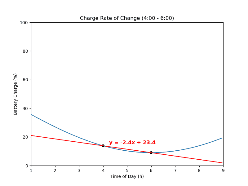
So, between 10:00 and 12:00, the battery charge is increasing at \(\frac{9.0\%}{hr}\). While between 04:00 and 06:00 the battery charge is decreasing at \(\frac{2.4\%}{hr}\).
Which does make some sense. In the first case it is likely sunny out; so, the battery is getting any charge from the solar panels and/or wind turbines not used by equipment running in the house. Which at that time of day could be quite minimal. E.G. single person household, children at school, one or both parents at work. In the latter case, it is likely still dark or nearly dark outside. People may be starting on their day. So, electrical equipment in the house is drawing on the battery since there is no or little charge coming from the solar panels. Though, if wind turbines are present, they may in fact be adding charge to the battery. Though perhaps not enough to overcome the household usage.
Now you probably think it would be nice to know the rate of change at exactly 11:00. Well, that’s what the derivative is for. But, we’re not going to actually do any calculus (if possible). For now, we can say that the rate of change for 10:00 to 12:00 approximates the rate of change for any time of day in that interval (inclusive). Ditto for the rate of change between 04:00 and 06:00. We’ll get back to this down the road.
Line for Rate of Change
As sort of mentioned earlier, the two times and the rate of change, in fact, define a secant line. Let’s look at plotting that line, for the second case above, on a zoomed in portion of the state of charge curve for our battery.
Now, to build a function to plot the line, we need to determine it’s equation. Base on my grade school geometry, a straight line takes the form, \(y = mx + b\). Where \(m\) is the \(slope\) (which we already have, i.e. the rate of change) and \(b\) is the \(y\text{–}intercept\). So, all we need to do is substitute the appropriate values in the equation and calculate the intercept. I.E. \(b = y - mx\).
And for our case, \(b =(13.8 - (-2.4 * 4))\) and \(b = 23.4\). So the equation for our rate of change line is \(y = -2.4x + 23.4\).
But let’s write a function to sort that out in Python. The function will in fact return a function. The returned function will be used to generate the data needed to plot the line on our state of charge graph. I may or may not ever use the function again, but it is a bit of practice and saves me some effort in generating the plot. Let’s give it a quick try. I will remove the print statement following our simple test.
... ...
def mk_ln_fn(slp, t1, y):
  # along w/function returning y-intercept as my need it elsewhere
  # now or later on
  y_int = y - (slp * t1)
  print(f"rate of change: mk_ln_fn -> y = {slp}x + {y_int:.1f}")
  def ln_fn(x):
    return (slp * x) + y_int

  return ln_fn, y_int
... ...
  ln_fn, _ = mk_ln_fn(roc, s_hr, s_soc)
And…
(mc-3.14) PS R:\learn\mc\calculus> python p_p1.py
rate of change: mk_ln_fn -> y = -2.4x + 23.4
Which agrees with the manually calculated result above.
Plot RoC Line on Zoomed Version of the State of Charge Plot
Okay, let’s look at getting that line plotted over the state of charge for a suitable period of time. For now, no new function—just a bit of hard coded text (some a repeat of previous code; my bad!).
... ...
  # plot zoomed in state of charge curve
  z_val = 3
  z1, z2 = max(s_hr - z_val, 0), min(e_hr + z_val, 24)
  t = np.arange(z1, z2, 0.05)
  s = soc_fn(t)
  xl = (z1, z2)
  yl = (0, 100)
  socp = soc_plot(ax, t, s, xl, yl)

  # get rate of change line equation and plot over curve generated above
  ln_fn, _ = mk_ln_fn(roc, s_hr, s_soc)
  p_l = ln_fn(t)
  ax.plot(t, p_l, c="r")

  # plot two points of interest
  dt_x, dt_y, dt_s = [s_hr, e_hr], [s_soc, e_soc], [30, 30]
  ax.scatter(dt_x, dt_y, c="k", alpha=1, s=dt_s)

  # add context to plot
  ax.set(xlabel='Time of Day (h)', ylabel='Battery Charge (%)',
        title=f'Charge Rate of Change ({s_hr}:00 - {e_hr}:00)')
  y_int = s_soc - (roc * s_hr)
  t_font = {'color':  'red',
        'weight': 'bold',
        'size': 12
        }
  plt.text(4.25, 15, f"y = {roc}x + {y_int:.1f}", fontdict=t_font)
  # fig.savefig("bat_roc_1.png")
  plt.show()
And…
M’thinks This One is Fini
I believe we’ve covered a reasonable amount of material. Have covered the basic idea of “rate of change”. And, produced a plot that graphically illustrates that concept. Good enough for one post. Not to mention I have put in a fair bit of time getting the post and related code completed. Including numerous edits following its tentative completion.
That said, we are set-up for the next step. See you next post.