Ok, no calculus this post. As I mentioned last time, working on the plots there was an issue that rather aggravated me. Especially the fact that I couldn’t find an easy solution.
It really bothered me that I had to hand/hard code the \(x\) and \(y\) values for positioning any text I was placing on the plots. Seemed to me it should be possible to write a function to do that work. I wanted to provide a tentative position, then if it overlapped anything else on the plot, it was to determine and return a better position. Otherwise it would just return the input values.
But, I could not for love (it is Valentines Day as I start work on this post’s draft) nor money figure out how to do so in any reasonable way. I ended up thinking I would need the inverses for the plot and rate of change equations—still think so. And, the function would likely only work with this specific situation. Probably no way to make it generally applicable.
That said, I am going to give it a try. At least for this particular state of charge curve. Probably a horrible waste of time and of a post. However, nothing ventured, nothing gained. Or so they say.
The Problem
Let’s have a look at some potential problem text locations. A few too many graphs, but a picture might be worth a thousand words in this case. I will be starting with some pretty trivial examples—though not totally so. But that will hopefully lead to an initial step or two in our solution. And, I will use both types of plots that were included in the preceding posts: rate of change line/tangent on state of charge curve and slope over zoomed in state of charge curve.
Let’s start with the first of those. And say half a dozen points on the state of charge curve. Putting all the tangents on one plot to reduce the number of plots that would be needed otherwise. That will likely change down the road.
New module, txt_loc.py. Copied in a bunch of functions from previous module(s). Won’t bother showing those. Also going to use command line parameters to control what the module does. Figured that might make life easier. Though am thinking all the related code is pretty sloppy. And, sorry, lots of code and probably not enough functions to isolate sections of it.
# txt_loc.py: figure out how to 'automate'and text placement so
#   text does not overlap any portion of a plotted curve/line
#
#   ver 1: 2026.02.14, rek

import argparse, math
import numpy as np
import matplotlib as mpl
import matplotlib.pyplot as plt


def get_arg_parser():
  """Create and return parser script inputs
     Used to control script execution, rather than
     just using hardcoded booleans (will allow both)

     Current blocks:
      est_df, items: none
      txt1, items 0-3
  """
  # instantiate and set up command paramter parser
  parser = argparse.ArgumentParser()
  # determine block of script to run, also controlled by boolean
  parser.add_argument("-c", "--code_block", type=str, help="Specify block/sub-section of code to execute")
  parser.add_argument("-i", "--item", type=int, help="Specify block item to run (int, index to list)")
  parser.add_argument("-s", "--save", action='store_true', help="If set, save image to file")
  return(parser)
... ...
# dictionary of options to be set using input arguments, a little looking ahead
blk_2b = {"est_df": False, "txt1": False, "txt2": False, "txt3": False, "txt4": False, "sv_plt": False}
# dictionary of maximum value for item value where allowed
blk_rng = {}
# current item value for specified code block
i_blk = -1

argp = get_arg_parser()
s_args = argp.parse_args()
s_blk = s_args.code_block
s_itm = s_args.item
if s_blk and s_blk in blk_2b:
  blk_2b[s_blk] = True
if s_blk in blk_rng and s_itm >= 0:
  if s_itm >= 0 and s_itm <= blk_rng[s_blk]:
    i_blk = s_itm
blk_2b["sv_plt"] = s_args.save
... ...
if blk_2b["txt1"]:
  # get list of times to play with
  hrs = np.arange(1, 24, 5)
  hrs = np.append(hrs, 22)

  # plot state of charge function
  fig, ax = plt.subplots(figsize=(8, 6))
  t = np.arange(0.0, 24.0, 0.05)
  s = soc_fn(t)
  xl = (0, 24)
  yl = (0, 100)
  socp = soc_plot(ax, t, s, xl, yl, params={"c": "b"})

  # for each of our play times
  for c_hr in hrs:
    # get and plot tangent
    c_chg = soc_fn(c_hr)
    dfhr = df_soc(c_hr)
    df_ln, y_int = mk_ln_fn(dfhr, c_hr, c_chg)
    t = np.arange(max(0, c_hr-4), min(24, c_hr+4), 0.05)
    p_l = df_ln(t)
    ax.plot(t, p_l, c="k", lw=1)

    # show each point used to generate tangent lines
    px, py = c_hr, c_chg
    # set color, weight, size and vertical alignment for points
    p_font = {
    'color': 'b',
    'size': 10,
    'va': "center",
    }
    ax.scatter(px, py, alpha=.6, c=p_font["color"], s=40)
    # add a little separation on x-axis, accounting for size of dots
    x_sep = .3
    print(f"point text location at: {px}, {py:.2f}")
    ax.text(px + x_sep, py, f"({px}, {py:.1f})", fontdict=p_font)

    # show function for each tangent line
    tx, ty = c_hr, c_chg
    # this will obviously overwrite the point coordinates text
    # so add a little separation
    ty += 3
    print(f"function text location at: {tx}, {ty:.2f}")
    # set color, weight, size and vertical alignment for points
    f_font = {'color': 'k',
    'size': 10,
    }
    ax.text(tx, ty, f"y = {dfhr:.9f}x {y_int:+.9f}", fontdict=f_font)

  if blk_2b["sv_plt"]:
    fig.savefig("img/text_1_1.png")
  plt.show()
And, in the terminal I get the following for one set of command line parameters.
(mc-3.14) PS R:\learn\mc\calculus> python txt_loc.py -c txt1
point text location at: 1, 35.68
function text location at: 1, 38.68
point text location at: 6, 9.00
function text location at: 6, 12.00
point text location at: 11, 35.68
function text location at: 11, 38.68
point text location at: 16, 76.18
function text location at: 16, 79.18
point text location at: 21, 70.46
function text location at: 21, 73.46
point text location at: 22, 63.00
function text location at: 22, 66.00
And, the resultling plot. A touch messy. But does the job.
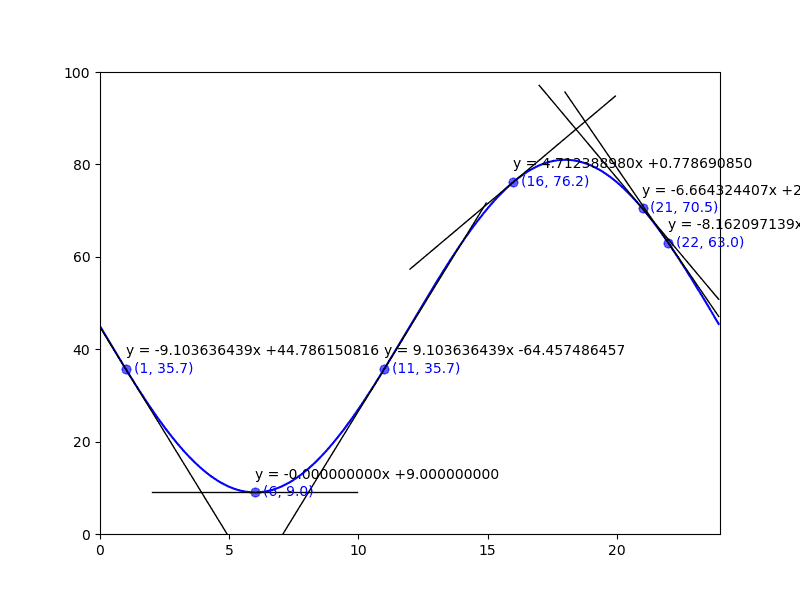
Pretty clearly some (maybe many) issues with the naive approach to placing text. Now the question is: can I figure out a way to resolve the problems in code. Really don’t like the manual, hard-coded location approach.
Let’s Get Some Information to Work With
When we are going to add our text to the plot we will know the tentative position of the text, its content, and alignments (horizontal and vertical). We will also likely know the font size, color, weight and such. But the latter items are not of any particular value in dealing with our problem.
We have some matplotlib methods to help us out (I hope).
matplotlib.pyplot.getp
Return the value of an Artist’s property, or print all of them.
In our case, text added to a plot is an artist. All we will need to do is assign the text method’s output to a variable to use in the call to getp.
matplotlib.text.Text.get_window_extent
Return the Bbox bounding the text, in display units.
Then there are a series of properties on the plot axis that can give us access to the artists currently drawn to the plot. E.G. ax.lines, ax.texts, ax.collections, etc.
Let’s have a look. For the purposes of this experiment I going to start by only plotting the point labels for a number of locations on the state of charge curve. I will include the plotting code and any attempt to get information related to the data point labels. Note, I won’t bother with the code for the state of charge curve.
Do note, the get_window_extent method returns the artist’s bounding box in display space coordinates. Not horribly useful for my purposes. So, a little extra work was needed to convert those coordinates to data coordinates (i.e. the hour and % charge for each corner).
if blk_2b["txt2"]:
  ... ...
# dictionary of options to be set using input arguments, a little looking ahead
blk_2b = {"est_df": False, "txt1": False, "txt2": False, "txt3": False, "txt4": False, "sv_plt": False}
# dictionary of maximum value for item value where allowed, min is 0
blk_rng = {"txt2": 2}
... ...
if blk_2b["txt2"]:
  # add some code control booleans, note I know of a couple more variations to deal with
  t_pt_lbls = (i_blk <= 2)  # will be true if i_blk == -1, i.e. no value passed in
  # plot points and their labels
  do_pt_lbls = True if t_pt_lbls else False
  # plot inverse, hour, for each point
  do_pt_inv = True if i_blk==1 else False
  # plot tangent and label for each point
  do_tngnts = True if i_blk==2 else False

  if do_pt_lbls:
    hrs = np.arange(0, 25, 2)
    hrs = np.append(hrs, 4.5)
  else:
    hrs = np.array([2, 5.25, 6, 12, 21, 22])
... ...
  # plot state of charge function
... ...
  # for each of our play times
  for c_hr in hrs:
    c_chg = soc_fn(c_hr)
... ...
    if do_pt_lbls:
      # show each point used to generate tangent lines
      px, py = c_hr, c_chg
      # set color, weight, size and vertical alignment for points
      p_font = {
      'color':  '#1f77b4',
      'size': 9,
      'va': "center",
      }
      ax.scatter(px, py, alpha=.6, c=p_font["color"], s=40, clip_on=False)
      # add a little separation on x-axis, accounting for size of dots
      x_sep = .3
      print(f"\npoint text location at: {px}, {py:.2f}")
      pt = ax.text(px + x_sep, py, f"({px}, {py:.1f})", fontdict=p_font)

    if do_pt_inv:
      # inverse of charge value, i.e. hour
... ...
    if do_tngnts:
      # get and plot tangent
      ... ...
      # show function for each tangent line
      ... ...
    if do_pt_lbls:
      # let's get and print info on bounding boxes for our point labels
      r = fig.canvas.get_renderer()
      bbp = pt.get_window_extent(renderer=r).transformed(plt.gca().transData.inverted())
      t_info = {
        'px0': bbp.x0,
        'py0': bbp.y0,
        'px1': bbp.x1,
        'py1': bbp.y1,
        'txt': plt.getp(pt, "text"),
        'ha': plt.getp(pt, "ha"),
        'va': plt.getp(pt, "va"),
      }
      print(t_info)

  if blk_2b["sv_plt"]:
    fig.savefig(f"img/text_2_{i_blk + 1}.png")
  plt.show()
And, in the terminal I got the following. (Note, I have manually added line breaks to improve the readability.)
(mc-3.14) PS R:\learn\mc\calculus> python txt_loc.py -c txt2 -i 0 -s
... removed  ...

point text location at: 2.0, 27.00
{'px0': np.float64(2.3), 'py0': np.float64(25.593073593073598),
 'px1': np.float64(4.845161290322581), 'py1': np.float64(28.40692640692641),
 'txt': '(2.0, 27.0)', 'ha': 'left', 'va': 'center'}

point text location at: 4.0, 13.82
{'px0': np.float64(4.299999999999999), 'py0': np.float64(12.4161590568338),
 'px1': np.float64(6.845161290322581), 'py1': np.float64(15.230011870686612),
 'txt': '(4.0, 13.8)', 'ha': 'left', 'va': 'center'}

point text location at: 6.0, 9.00
{'px0': np.float64(6.300000000000001), 'py0': np.float64(7.593073593073592),
 'px1': np.float64(8.535483870967742), 'py1': np.float64(10.406926406926408),
 'txt': '(6.0, 9.0)', 'ha': 'left', 'va': 'center'}

point text location at: 8.0, 13.82
{'px0': np.float64(8.3), 'py0': np.float64(12.4161590568338),
 'px1': np.float64(10.845161290322581), 'py1': np.float64(15.230011870686612),
 'txt': '(8.0, 13.8)', 'ha': 'left', 'va': 'center'}

... a few removed ...

point text location at: 16.0, 76.18
{'px0': np.float64(16.299999999999997), 'py0': np.float64(74.76998812931338),
'px1': np.float64(19.154838709677417), 'py1': np.float64(77.5838409431662),
'txt': '(16.0, 76.2)', 'ha': 'left', 'va': 'center'}

point text location at: 18.0, 81.00
{'px0': np.float64(18.3), 'py0': np.float64(79.59307359307361),
'px1': np.float64(21.15483870967742), 'py1': np.float64(82.40692640692642),
'txt': '(18.0, 81.0)', 'ha': 'left', 'va': 'center'}

point text location at: 20.0, 76.18
{'px0': np.float64(20.3), 'py0': np.float64(74.76998812931339),
 'px1': np.float64(23.15483870967742), 'py1': np.float64(77.58384094316621),
 'txt': '(20.0, 76.2)', 'ha': 'left', 'va': 'center'}

point text location at: 22.0, 63.00
{'px0': np.float64(22.300000000000004), 'py0': np.float64(61.593073593073605),
 'px1': np.float64(25.15483870967742), 'py1': np.float64(64.40692640692643),
 'txt': '(22.0, 63.0)', 'ha': 'left', 'va': 'center'}

point text location at: 24.0, 45.00
{'px0': np.float64(24.3), 'py0': np.float64(43.5930735930736),
'px1': np.float64(27.15483870967742), 'py1': np.float64(46.40692640692642),
'txt': '(24.0, 45.0)', 'ha': 'left', 'va': 'center'}

... removed ...
We have the exact corners for the box covering each text item. We can hopefully use that to determine when we need to do something about the placment of the text item.
And the resulting plot.
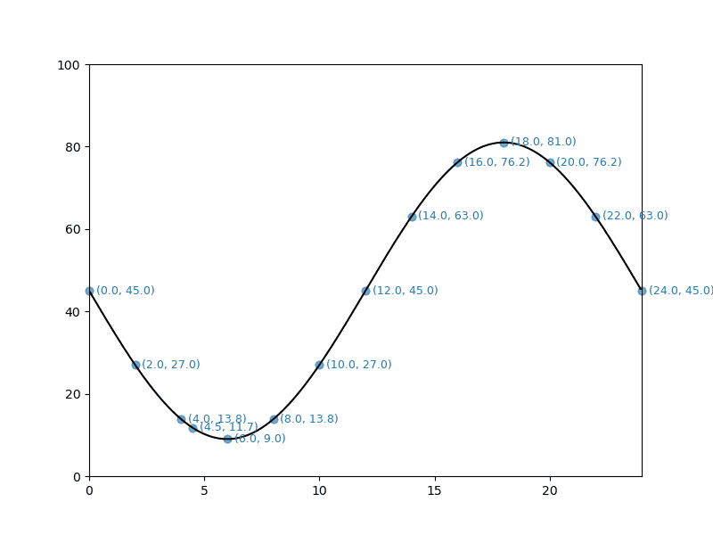
In general I am not concerned with the data coordinate text overlapping the tangent line once plotted. Since the tangent should be touching the state of charge curve at the data point location, the odds of an overlap are limited. With two exceptions. The minimum and maximum values for the curve. The data point text is clearly overlapping the curve at those locations. The other locations of concern are those that extend past the plot axis boundaries, and those with charge values near the minimum and maximum of the curve.
All in all a limited number of text locations that will need fixing. Though it remains to be seen if the fixes can be coded in a way that might generalize to other curves.
I next added some code to, for informational purposes, look at using those axis properties mentioned above.
    print(f"\nax lines ({len(ax.lines)})")
    for chd in ax.lines:
      print(chd.get_bbox())
    print(f"\nax texts ({len(ax.texts)})")
    r = fig.canvas.get_renderer()
    for chd in ax.texts:
      bbp = chd.get_window_extent(renderer=r).transformed(plt.gca().transData.inverted())
      c_txt = plt.getp(chd, "text")
      print(c_txt, "\n\t", bbp)
    print(f"\nax collections ({len(ax.collections)})")
    for chd in ax.collections:
      print(chd.get_offsets(), chd.get_sizes())
And here’s the additional information written to the terminal with the code above.
ax lines (1)
Bbox(x0=0.0, y0=8.999999999999998, x1=23.950000000000003, y1=81.0)

ax texts (14)
(0.0, 45.0)
         Bbox(x0=0.2999999999999998, y0=43.59307359307359, x1=2.845161290322581, y1=46.4069264069264)
(2.0, 27.0)
         Bbox(x0=2.3, y0=25.593073593073598, x1=4.845161290322581, y1=28.40692640692641)
(4.0, 13.8)
         Bbox(x0=4.299999999999999, y0=12.4161590568338, x1=6.845161290322581, y1=15.230011870686612)
(6.0, 9.0)
         Bbox(x0=6.300000000000001, y0=7.593073593073592, x1=8.535483870967742, y1=10.406926406926408)
(8.0, 13.8)
         Bbox(x0=8.3, y0=12.4161590568338, x1=10.845161290322581, y1=15.230011870686612)
(10.0, 27.0)
         Bbox(x0=10.299999999999999, y0=25.593073593073598, x1=13.15483870967742, y1=28.40692640692641)
(12.0, 45.0)
         Bbox(x0=12.3, y0=43.59307359307359, x1=15.15483870967742, y1=46.4069264069264)
(14.0, 63.0)
         Bbox(x0=14.3, y0=61.59307359307359, x1=17.154838709677424, y1=64.40692640692642)
(16.0, 76.2)
         Bbox(x0=16.299999999999997, y0=74.76998812931338, x1=19.154838709677417, y1=77.5838409431662)
(18.0, 81.0)
         Bbox(x0=18.3, y0=79.59307359307361, x1=21.15483870967742, y1=82.40692640692642)
(20.0, 76.2)
         Bbox(x0=20.3, y0=74.76998812931339, x1=23.15483870967742, y1=77.58384094316621)
(22.0, 63.0)
         Bbox(x0=22.300000000000004, y0=61.593073593073605, x1=25.15483870967742, y1=64.40692640692643)
(24.0, 45.0)
         Bbox(x0=24.3, y0=43.5930735930736, x1=27.15483870967742, y1=46.40692640692642)
(4.5, 11.7)
         Bbox(x0=4.800000000000001, y0=10.333410422667269, x1=7.345161290322581, y1=13.14726323652008)

ax collections (14)
[[0.0 45.0]] [40]
[[2.0 27.000000000000004]] [40]
[[4.0 13.823085463760208]] [40]
[[6.0 8.999999999999998]] [40]
[[8.0 13.823085463760204]] [40]
[[10.0 27.000000000000004]] [40]
[[12.0 44.99999999999999]] [40]
[[14.0 62.99999999999999]] [40]
[[16.0 76.17691453623978]] [40]
[[18.0 81.0]] [40]
[[20.0 76.17691453623979]] [40]
[[22.0 63.000000000000014]] [40]
[[24.0 45.00000000000001]] [40]
[[4.5 11.740336829593675]] [40]
Because each dot and text item were plotted individually in a loop, each one became an individual artist. If I had plotted all the dots in a single scatter plot instance, that would likely not be the case for them. (I might try that to see what we get when accessing ax.collections in that case). Also, because I appended the hour of 4.5 to the arange array, that data is shown last, as it was plotted last.
The bounding box for the one line (the plot of the state of charge) covers the curve’s extremes. So one big box.
The data for the texts matches what we got above. I did not look at displaying the item’s text nor any of it’s alignments. Though I am sure I could have done so.
The items in the collections list are in fact the dots plotted over the curve for each point (scatter).
Not sure how useful any of the above will be. But, I did learn a little more about matplotlib.
Inverse Function
Post is getting pretty long. But before considering ending it and continuing in a new post, one more thing I’d like to look at.
It occurred to me that I would need to locate any other points on the curve for a given % charge. I figured that would make it easier for me to tell if the data point label was crossing the curve at some point. Given it is a modified sine curve there should in fact be 2 different hours with the same % charge value. So, I wrote a function to return the inverse value (i.e. the hour) for any % charge.
And because we are not visualizing calculus concepts in this post, I will include the derivation of the inverse equation. You may remember from geometry classes that the \(arcsin\) is the inverse of the \(sine\) function. We will be using the \(arcsin\). No explanations, just a set of transformations to outline the process.
$$y = ((\sin(-\pi * \frac{\text{hrs}} {12}) * 0.8) + 1) * 45$$ $$\frac{(\frac{y} {45} - 1)} {0.8} = \sin(-\pi * \frac{\text{hrs}} {12})$$ $$\arcsin(\frac{(\frac{y} {45} - 1)} {0.8}) = -\pi * \frac{\text{hrs}} {12}$$ $$\text{hrs} = -(\frac{12} {\pi}) * \arcsin(\frac{(\frac{y} {45} - 1)} {0.8})$$
And a new function in the module.
def soc_inv(soc):
  ''' Inverse of soc_fn, return hr for given soc
  '''
  hr = -(12 / np.pi) * np.arcsin((soc / 45 - 1) / 0.8)
  # convert negative times to 24 hour clock
  hr %= 24
  return hr
And, add some code to add the points generated by the inverse function to the plot. I reduced the list of data points, didn’t need the plot to be overly cluttered.
... ...
  if do_pt_inv:
    hrs = np.arange(0, 25, 3)
  elif do_pt_lbls:
    hrs = np.arange(0, 25, 2)
    hrs = np.append(hrs, 4.5)
  else:
    hrs = np.array([2, 5.25, 6, 12, 21, 22])
... ...
    if do_pt_inv:
      # inverse of charge value, i.e. hour
      x_hr = soc_inv(c_chg)
      # plot inverse in fuschia and ensure it is plotted on top of any other point
      ax.scatter(x_hr, c_chg, c="#ff00ff", s=25, clip_on=False, zorder=5.0)
      print(f"soc_inv({c_chg:.2f}) = {x_hr:.2f}")
And, the plot including the inverse data points looks like the following.
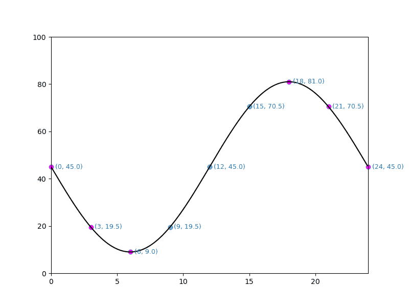
Not what I was hoping for. For example, for the point, \((0, 45)\) I wanted the inverse point to be at \((12, 45)\)—no fuschia dot there. And for \((3, 19.5)\) to be at \((9, 19.5)\)—again no fuschia dot there. Instead the inverse points are actually over the source point. This issue occured for all times \(<=6\) and \(>=18\). For the times between those two ranges I got what I wanted, an inverse point at a different location.
This is very clear in the collections output in the terminal. I have edited the terminal output for clarity, I hope.
ax collections (18)
# the following have the inverse point at the source point
[[0.0 45.0]] [40] -> [[24.0 45.0]] [25]
[[3.0 19.544155877284286]] [40]-> [[2.9999999999999996 19.544155877284286]] [25]
[[6.0 8.999999999999998]] [40] -> [[6.0 8.999999999999998]] [25]

# the following have the inverse point at a different location
[[9.0 19.544155877284286]] [40] -> [[2.9999999999999996 19.544155877284286]] [25]
[[12.0 44.99999999999999]] [40] -> [[5.300924469105861e-16 44.99999999999999]] [25]
[[15.0 70.4558441227157]] [40] -> [[21.0 70.4558441227157]] [25]

# the following also have the inverse point at the source point
[[18.0 81.0]] [40] -> [[18.0 81.0]] [25]
[[21.0 70.45584412271572]] [40] -> [[21.0 70.45584412271572]] [25]
[[24.0 45.00000000000001]] [40] -> [[24.0 45.00000000000001]] [25]
Now for the minimum and maximum points I would expect that to be the case. But why the others. I messed with this for quite some time—days in fact. Didn’t see a solution. Then, several nights later, 2026.02.18, I woke around the midnight hour and started thinking. After half an hour or so, I had a potential answer to my dilemma.
What’s Happening
Let’s go back to basics. We will discuss \(y = sin(x)\) where \(x\) is in radians. You will likely recall that \(sin(0) = 0\), \(sin(\pi/2) = 1\) and \(sin(\pi) = 0\), \(sin(1.5\pi) = -1\) and \(sin(2\pi) = 0\) completing the cycle. Our plot, though based on the sine, doesn’t look like that basic sine curve. Our curve uses values of \(0\ \text{to}\ -2\pi\). So our curve travels in the opposite direction. We have effectively shifted the sine curve to the right by the value of \(\pi\).
Now, the output values of np.arcsin are constrained to a specific range.
arcsin is a multivalued function: for each x there are infinitely many numbers z such that (sin(z) = x). The convention is to return the angle z whose real part lies in \([-\pi/2, \pi/2]\).
numpy.arcsin
In our case, \(-\pi/2\) is equal to 06:00 and \(\pi/2\) is 18:00. And since 24:00 is equivalent to 00:00, in our case arcsin is constrained to the range 18:00 - 06:00. Or the two ranges 00:00 - 06:00 and 18:00 - 24:00. So how do we get the other x value when our starting data point is in that constrained range.
A little playing around with the sine and arcsine.
(mc-3.14) PS R:\learn\m4p\calculus> python
Python 3.14.2 | packaged by conda-forge | (main, Jan 26 2026, 19:49:55) [MSC v.1944 64 bit (AMD64)] on win32
>>> import math
>>> import numpy as np
>>> math.sin(-np.pi*6/12)
-1.0
>>> math.sin(np.pi*3/2)
-1.0
>>> math.sin(-np.pi*18/12)
1.0
>>> math.sin(np.pi/2)
1.0
>>> math.sin(0.75)
0.6816387600233341
>>> math.asin(0.68163876)
0.7499999999681092
>>> np.pi - math.asin(0.68163876)
2.391592653621684
>>> math.sin(2.391592653621684)
0.68163876
>
For the true sine curve, once we have \(x = arcsin(y)\) obtaining the second x-axis value with the same sine value as \(x\) is pretty straightforward. That second value is simply \(\pi - x\). On our curve, the hour value for \(\pi\) is 12:00. So, will \(12 - x\) do the trick?
>>> import txt_loc as tl
>>> tl.soc_fn(4)
np.float64(13.823085463760208)
>>> tl.soc_inv(13.823085463760208)
np.float64(3.9999999999999996)
>>> tl.soc_fn(12 - 4)
np.float64(13.823085463760204)
>>> tl.soc_fn(20)
np.float64(76.17691453623979)
>>> tl.soc_inv(76.17691453623979)
np.float64(20.0)
>>> tl.soc_fn(12 - 20)
np.float64(76.1769145362398)
(12 - 20) % 24
16
>>> tl.soc_fn(16)
np.float64(76.17691453623978)
It looks like we just have to add code to our function to deal with the constrained value cases and we should be good to go. To get things to actually work I needed to pass the function the time used to determine the given state of charge. Then check to see if the time was in arcsin’s constrained range. If so, proceed accordingly.
... ...
def soc_inv(soc, i_hr):
  ''' Inverse of soc_fn, return hour/time of day for given soc
    :param: soc, state of charge % value for which to find inverse
    :param: i_hr, the hour/time used to generate soc

    returns: if available the other time that generates the passed soc
  '''
  hr = -(12 / np.pi) * np.arcsin((soc / 45 - 1) / 0.8)
  # convert negative times or times >= 24 to 24 hour clock
  hr %= 24
  # i_hr in arcsin's constrained range of outputs, get other value
  if i_hr <= 6 or i_hr >= 18:
    hr = (12 - hr) % 24
  return hr
In the terminal, the collections’ artists properties were as follows. Once again edited by me for readability/meaningfulness.
ax collections (18)
[[0.0 45.0]] [40] -> [[12.0 45.0]] [25]
[[3.0 19.544155877284286]] [40] -> [[9.0 19.544155877284286]] [25]
[[6.0 8.999999999999998]] [40] -> [[6.0 8.999999999999998]] [25]
[[9.0 19.544155877284286]] [40] -> [[2.9999999999999996 19.544155877284286]] [25]
[[12.0 44.99999999999999]] [40] -> [[5.300924469105861e-16 44.99999999999999]] [25]
[[15.0 70.4558441227157]] [40] -> [[21.0 70.4558441227157]] [25]
[[18.0 81.0]] [40] -> [[18.0 81.0]] [25]
[[21.0 70.45584412271572]] [40] -> [[15.0 70.45584412271572]] [25]
[[24.0 45.00000000000001]] [40] -> [[12.0 45.00000000000001]] [25]
And here’s the resulting plot.
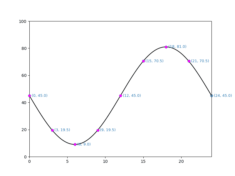
And, for our simple test points that appears to work as desired.
Fini, je crois
I worked on the code for the various sections long before starting work on the post. And in some cases for a number of days. With the exception of the “What’s Happening” section. The code and post content for that section were all done at the same time—the day after my nightmare insight.
The code and post have taken me long enough and the latter has gotten long enough that I think I am going to consider it finished. I wasn’t expecting this subject to take more than one post; but, there you go.
Until next time, may your insights arrive much more quickly than mine seem to.
Resources
- matplotlib.axes.Axes.text
- matplotlib.axes.Axes.scatter
- matplotlib.collections.PathCollection
- matplotlib.lines.Line2D
- matplotlib.pyplot.getp
- matplotlib.text.Text.get_window_extent
- “Artist” in Matplotlib